The problem with "put everything out and hope"
You've seen it. A table with forty prints taped up in no particular order, every colour fighting every other colour, and your eye just bounces off the whole thing without landing anywhere. That's not a talent problem. That's a colour problem, and it's one of the easiest things to fix once you see it.
Colour blocking just means grouping your work by colour family instead of by series, size, or the order you printed them in. It sounds almost too simple to matter, but it's the difference between a booth that reads as "one cohesive artist" from twenty feet away and one that reads as a yard sale.
Why your art disappears into itself
If you draw a lot of characters, chances are a good chunk of your prints land in similar tones: skin tones, denim blues, forest greens, whatever your palette tends toward. Hang them edge to edge in print order and they blur into a wash of similar hues. Nothing pops because everything is competing for the same visual space.
Group by colour instead and something clicks. A cluster of warm oranges and reds next to a cluster of cool blues creates a visual break your eye actually registers. People walking a convention floor are scanning fast, often from ten or fifteen feet away, and a booth with clear colour zones is just easier for a tired brain to process than one that's visually flat.
How to actually do it without repainting your whole catalogue
You're not changing your art to fit a colour wheel. You're just being intentional about placement.
- Pull your prints into rough piles: warm, cool, neutral/black-and-white, and "loud" (anything neon or high-saturation that needs its own space so it doesn't clash).
- Give each pile its own zone on your grid wall or panel run rather than scattering them evenly.
- Use a neutral piece as a buffer between two loud zones instead of jamming saturated colours directly against each other.
- Save your single best, most colour-punchy piece for eye level, dead centre. That's your scroll-stopper.
Let your backdrop do some of the work
This is where panel colour choice actually matters, not just as a styling preference but as a functional tool. A single flat backdrop colour behind a busy, multi-coloured print grid can either help or hurt depending on what you pick. Frosted white or a light neutral tends to let every print colour read true. A saturated backdrop can wash out prints in a similar hue or make an unrelated colour zone look like it belongs to a different table.
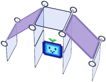
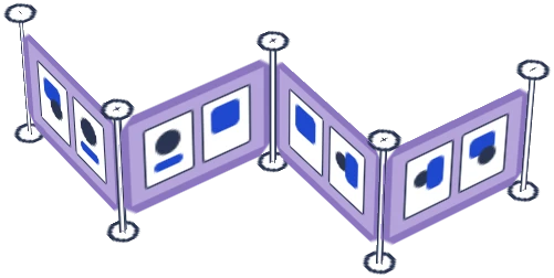
If you're working with a two-tone kit like the Shapeshift Duo, this is actually a nice built-in advantage: you can run one frosted colour behind your cooler-toned work and a second behind your warmer pieces, using the booth structure itself to reinforce the colour blocking instead of fighting it. It's optional, not a rule, but it's a trick a lot of vendors don't think to use until someone points it out.
Common mistakes worth naming
| Mistake | Why it hurts | Fix |
|---|---|---|
| Alphabetising or sorting by series | Ignores colour completely, so palettes clash at random | Sort by colour family first, series second |
| Rainbow-ordering everything | Reads as a colour chart, not curated art | Group in blocks of 3-6 similar pieces, not a gradient |
| Loud colours touching on both sides | Nothing gets to breathe, eye can't rest | Buffer with neutral or negative space |
| Same colour blocking every con | Regulars stop noticing your table | Reshuffle blocks a few times a season |
None of this needs new inventory or a redesign. It's an afternoon of sorting prints into piles before your next con, and it's one of those changes that pays off immediately. You'll notice it yourself walking up to your own table before anyone else says a word about it.
Curious what a Shapeshift kit actually looks like in person? Head to the Artist Booths homepage to see the full lineup and find the one that fits your table.

![Artistbooths Bundle Component Frosted Lavender Purple (PMS 2715 C) Panel Square (35x35 cm) [8-pack]](http://artistbooths.com/cdn/shop/files/artistbooths-bundle-component-frosted-lavender-purple-pms-2715-c-boof-panel-square-35x35-cm-8-pack-1214015634.png?v=1767318728&width=300)




![Artistbooths Bundle Component Frosted Lilac Purple (PMS 263 C) BOOF Panel Triangle (35x35 cm) [2-pack]](http://artistbooths.com/cdn/shop/files/artistbooths-bundle-component-frosted-lilac-purple-pms-263-c-boof-panel-triangle-35x35-cm-2-pack-1214015625.png?v=1767318428&width=300)



































![Square Panel [24 Pack] (35cm / 13.8in) Add-on](http://artistbooths.com/cdn/shop/files/Bulk_thumbnails-14.png?v=1782275611&width=320)
![Self Serve Hook with wire grid T clip 8cm [10 pack] Add-on](http://artistbooths.com/cdn/shop/files/artistbooths-booth-garage-t-section-self-serve-grid-hook-8cm-10pcs-1234044856.png?v=1776916212&width=320)
![Self serve display Grid & Intersection Hook expansion pack [12/24 Mixed pack] Add-on](http://artistbooths.com/cdn/shop/files/artistbooths-booth-garage-12-pack-2-grid-10-hooks-self-serve-display-grid-intersection-hook-expansion-pack-12-24-mixed-pcs-1234209872.png?v=1777005938&width=320)
![Multi Connector Expansion Pack - White - Bundle & Save [16/32 mixed pack] Add-on](http://artistbooths.com/cdn/shop/files/artistbooths-booth-garage-16-mixed-connector-pro-pack-connector-pro-expansion-pack-white-bundle-save-16-32-mixed-pcs-1234209875.png?v=1777005971&width=320)

![Mini Rectangle Panels [5-Pack] (17cm x 35cm/6.69in x 13.78in) Add-on](http://artistbooths.com/cdn/shop/files/artistbooths-booth-garage-frosted-amber-yellow-pms-1235-c-half-squares-10-pack-17cm-6-69in-1229850280.png?v=1774848457&width=320)
![Foot Connector Expansion Pack [4 Pcs] Add-on](http://artistbooths.com/cdn/shop/files/artistbooths-booth-garage-white-foot-connector-4-pcs-1233353183.png?v=1776908318&width=320)
![Mixed Single & Double Wire Shelf Clip [9 pack] Add-on](http://artistbooths.com/cdn/shop/files/mixed-single-double-wire-shelf-clip-9-pack_0c6e301c-8a76-411c-962a-8bf135de46c4.png?v=1792031372&width=320)
![Booth Wheel & Wheel Connector - white - [4 pack] Add-on](http://artistbooths.com/cdn/shop/files/artistbooths-booth-garage-booth-wheel-4pcs-wheel-connector-4-pcs-white-1234044880.png?v=1776916093&width=320)
![Corner Connector Expansion Pack [8 pack] Add-on](http://artistbooths.com/cdn/shop/files/artistbooths-booth-garage-white-corner-connector-expansion-pack-4-pcs-1234044868.png?v=1776915937&width=320)
![Edge Connector [8 pack] Add-on](http://artistbooths.com/cdn/shop/files/artistbooths-booth-garage-white-edge-connector-4-pcs-1234044876.png?v=1776915671&width=320)
![Single Shelf Wire Clip White [5 pack] Add-on](http://artistbooths.com/cdn/shop/files/artistbooths-booth-garage-single-shelf-wire-clip-white-5pcs-1234044883.png?v=1776915612&width=320)
![Double shelf wire clip white [4 pack] Add-on](http://artistbooths.com/cdn/shop/files/artistbooths-booth-garage-white-double-shelf-wire-clip-4-pack-1233353188.png?v=1776771613&width=320)
![Self serve display Grid & Fold Hook expansion pack [12/24 Mixed pack] Add-on](http://artistbooths.com/cdn/shop/files/artistbooths-booth-garage-12-pack-2-grid-10-fold-hooks-self-serve-display-grid-fold-hook-expansion-pack-12-24-mixed-pcs-1234209869.png?v=1777005852&width=320)
![Foldable Self Serve Hook (with wire clip) - [20 pack] Add-on](http://artistbooths.com/cdn/shop/files/artistbooths-booth-garage-white-foldable-self-serve-hook-wire-clip-version-10-pcs-1234214602.png?v=1777016318&width=320)
![Foldable Self Serve Hooks (with adhesive sheet) [20 pack] Add-on](http://artistbooths.com/cdn/shop/files/artistbooths-booth-garage-white-foldable-self-serve-hooks-adhesive-version-10-pcs-1234214609.png?v=1777016200&width=320)
![Metal mallet (with dual rubber/soft tap sides) [1 pc] Add-on](http://artistbooths.com/cdn/shop/files/artistbooths-bundle-component-dual-headed-metal-mallet-with-soft-tap-side-1209303104.png?v=1764380999&width=320)
![Panel Clamp Black 3cm Mouth [4 pcs] Add-on](http://artistbooths.com/cdn/shop/files/artistbooths-booth-garage-panel-clamp-2-pcs-1233843253.png?v=1776843493&width=320)