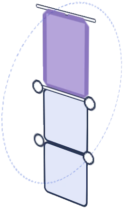
Two products, two completely different jobs
An original painting and a $15 print of that same piece are not the same product wearing different price tags. They need different protection, different framing, different lighting, and honestly, different psychology from the customer standing in front of them. Put them on the same table with the same treatment and you'll undersell the original and oversell the print, which is the opposite of what you want.
Why originals need to look expensive, because they are
A customer deciding whether to spend $200-800 on an original needs to feel like they're looking at something precious, not something that got knocked off a folding table by an elbow ten minutes ago. A few things do a lot of work here:
- Height and separation. Originals belong higher up and physically apart from your print bins, ideally at eye level where they can't get bumped by browsing hands reaching for cheaper stuff.
- A frame or a mount, even a basic one. An unframed original propped against a stand looks unfinished next to a print that's already bagged and boarded. Even a simple black frame or float mount signals "this is the real thing."
- Breathing room. Don't crowd originals together the way you might cluster $10 prints for visual density. One or two per section, with actual negative space around them, reads as curated rather than crammed in.
- A visible price, but handled differently. A small discreet tag rather than a big sticker price. The presentation itself should feel a notch above your impulse-buy signage.
Why prints need density and speed, not preciousness
Prints are the opposite problem. A customer buying a $12-20 print wants to browse fast, flip through a bin or scan a grid wall, and grab two or three without a production. Over-precious presentation on prints (fussy individual lighting, wide spacing, formal framing) actually slows down browsing and can make people feel like they need permission to touch something.
Bins, print racks, or a tightly packed grid wall with clear pricing work better here. Bagged and boarded is still worth doing for quality's sake, but the display treatment should say "grab me" not "look but don't touch."
The physical layout that actually works
A lot of vendors run into trouble because they try to display both on the same flat plane, usually a single grid wall, and end up with originals and prints visually blending into one busy wash. A cleaner split usually looks like this:
| Zone | What goes here | Display approach |
|---|---|---|
| Upper eye-level | 1-3 originals, your best pieces | Framed, spaced apart, minimal competing colour nearby |
| Mid grid wall | Small/medium prints | Dense grid, bagged, clipped, priced visibly |
| Tabletop | Bins, stickers, smaller prints | Sorted by price point, self-serve friendly |
The height separation is doing more work than people expect. Even a foot or two of vertical distance between your originals and your bins changes how a customer's brain categorises what they're looking at before they've consciously thought about it.
If you're tight on space
Not everyone's got the footprint for three distinct zones. If you're working a smaller table, prioritise separating originals from prints even if it's just a physical divider (a small easel, a raised riser block, anything that breaks the flat plane) rather than trying to build three full zones. A single riser under one or two originals does more for perceived value than people expect from something so simple.
For vendors building this out properly, a taller panel structure like the Shapeshift gives you the vertical range to actually separate an originals zone from a print grid without needing a second table. It's the kind of layout problem that's much easier to solve with panels you can reconfigure than with a fixed shelf unit you're stuck with every con.
None of this is about making your prints look cheap. It's about making sure your originals get the presentation that matches what you're asking someone to pay for them, while your prints stay easy and fast to browse. Different products, different jobs.
Curious what a Shapeshift kit actually looks like in person? Head to the Artist Booths homepage to see the full lineup and find the one that fits your table.

![Artistbooths Bundle Component Frosted Lavender Purple (PMS 2715 C) Panel Square (35x35 cm) [8-pack]](http://artistbooths.com/cdn/shop/files/artistbooths-bundle-component-frosted-lavender-purple-pms-2715-c-boof-panel-square-35x35-cm-8-pack-1214015634.png?v=1767318728&width=300)




![Artistbooths Bundle Component Frosted Lilac Purple (PMS 263 C) BOOF Panel Triangle (35x35 cm) [2-pack]](http://artistbooths.com/cdn/shop/files/artistbooths-bundle-component-frosted-lilac-purple-pms-263-c-boof-panel-triangle-35x35-cm-2-pack-1214015625.png?v=1767318428&width=300)































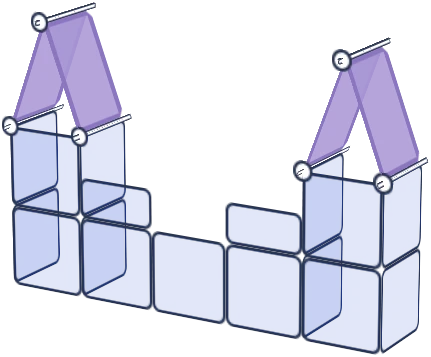







![Square Panel [24 Pack] (35cm / 13.8in) Add-on](http://artistbooths.com/cdn/shop/files/Bulk_thumbnails-14.png?v=1782275611&width=320)
![Self Serve Hook with wire grid T clip 8cm [10 pack] Add-on](http://artistbooths.com/cdn/shop/files/artistbooths-booth-garage-t-section-self-serve-grid-hook-8cm-10pcs-1234044856.png?v=1776916212&width=320)
![Self serve display Grid & Intersection Hook expansion pack [12/24 Mixed pack] Add-on](http://artistbooths.com/cdn/shop/files/artistbooths-booth-garage-12-pack-2-grid-10-hooks-self-serve-display-grid-intersection-hook-expansion-pack-12-24-mixed-pcs-1234209872.png?v=1777005938&width=320)
![Multi Connector Expansion Pack - White - Bundle & Save [16/32 mixed pack] Add-on](http://artistbooths.com/cdn/shop/files/artistbooths-booth-garage-16-mixed-connector-pro-pack-connector-pro-expansion-pack-white-bundle-save-16-32-mixed-pcs-1234209875.png?v=1777005971&width=320)

![Mini Rectangle Panels [5-Pack] (17cm x 35cm/6.69in x 13.78in) Add-on](http://artistbooths.com/cdn/shop/files/artistbooths-booth-garage-frosted-amber-yellow-pms-1235-c-half-squares-10-pack-17cm-6-69in-1229850280.png?v=1774848457&width=320)
![Foot Connector Expansion Pack [4 Pcs] Add-on](http://artistbooths.com/cdn/shop/files/artistbooths-booth-garage-white-foot-connector-4-pcs-1233353183.png?v=1776908318&width=320)
![Mixed Single & Double Wire Shelf Clip [9 pack] Add-on](http://artistbooths.com/cdn/shop/files/mixed-single-double-wire-shelf-clip-9-pack_0c6e301c-8a76-411c-962a-8bf135de46c4.png?v=1792031372&width=320)
![Booth Wheel & Wheel Connector - white - [4 pack] Add-on](http://artistbooths.com/cdn/shop/files/artistbooths-booth-garage-booth-wheel-4pcs-wheel-connector-4-pcs-white-1234044880.png?v=1776916093&width=320)
![Corner Connector Expansion Pack [8 pack] Add-on](http://artistbooths.com/cdn/shop/files/artistbooths-booth-garage-white-corner-connector-expansion-pack-4-pcs-1234044868.png?v=1776915937&width=320)
![Edge Connector [8 pack] Add-on](http://artistbooths.com/cdn/shop/files/artistbooths-booth-garage-white-edge-connector-4-pcs-1234044876.png?v=1776915671&width=320)
![Single Shelf Wire Clip White [5 pack] Add-on](http://artistbooths.com/cdn/shop/files/artistbooths-booth-garage-single-shelf-wire-clip-white-5pcs-1234044883.png?v=1776915612&width=320)
![Double shelf wire clip white [4 pack] Add-on](http://artistbooths.com/cdn/shop/files/artistbooths-booth-garage-white-double-shelf-wire-clip-4-pack-1233353188.png?v=1776771613&width=320)
![Self serve display Grid & Fold Hook expansion pack [12/24 Mixed pack] Add-on](http://artistbooths.com/cdn/shop/files/artistbooths-booth-garage-12-pack-2-grid-10-fold-hooks-self-serve-display-grid-fold-hook-expansion-pack-12-24-mixed-pcs-1234209869.png?v=1777005852&width=320)
![Foldable Self Serve Hook (with wire clip) - [20 pack] Add-on](http://artistbooths.com/cdn/shop/files/artistbooths-booth-garage-white-foldable-self-serve-hook-wire-clip-version-10-pcs-1234214602.png?v=1777016318&width=320)
![Foldable Self Serve Hooks (with adhesive sheet) [20 pack] Add-on](http://artistbooths.com/cdn/shop/files/artistbooths-booth-garage-white-foldable-self-serve-hooks-adhesive-version-10-pcs-1234214609.png?v=1777016200&width=320)
![Metal mallet (with dual rubber/soft tap sides) [1 pc] Add-on](http://artistbooths.com/cdn/shop/files/artistbooths-bundle-component-dual-headed-metal-mallet-with-soft-tap-side-1209303104.png?v=1764380999&width=320)
![Panel Clamp Black 3cm Mouth [4 pcs] Add-on](http://artistbooths.com/cdn/shop/files/artistbooths-booth-garage-panel-clamp-2-pcs-1233843253.png?v=1776843493&width=320)