She didn't plan it. That's the part people always get wrong when they hear the story.
Mika started selling stickers at a local pop-up market in 2022. Her art was good. Lively character designs, bold linework, lots of expression. But her table looked like everyone else's. White tablecloth. A few acrylic stands. Prints fanned out in a row. Nothing wrong with it. Nothing memorable about it either.
Then she bought her first modular display kit. A Core kit, 24 panels, in coral.
The Coral Table
She picked coral because she liked it. No brand strategy. No mood board. Just a colour that made her happy. She built a simple L-shaped wall behind her table, hung her prints with the included PLA hooks, and went to her next market.
Three things happened that day. First, people started walking toward her table from across the room. The coral wall was visible from the entrance. Second, someone said, "Oh, you're the coral girl!" Third, she sold out of two designs before lunch.
She hadn't changed her art. She hadn't changed her prices. She'd changed her backdrop.
Leaning Into It
After that market, Mika started noticing something. People were tagging her as "the coral booth" on social media. Not by her artist name. By her colour. She could have fought it. Instead she leaned all the way in.
She updated her logo to include a coral accent. Changed her packaging tape to coral. Started posting setup photos where the coral wall was the FIRST thing you saw. Her Instagram grid turned into this cohesive coral-and-white feed that looked intentional even though it started as an accident.
When she upgraded to a Shapeshift (46 panels) from the full kit range, she kept every single panel in coral. No accent colour. No mixed setup. Pure coral wall, white table, bold art. That was the brand.
What A Colour Does That A Logo Can't
Here's the thing about artist alley. People are walking past dozens of tables. They're overstimulated. They're scanning. A logo on a banner is great but it requires someone to stop and read it. A colour hits before the brain even processes what it's looking at.
Mika's coral wall worked because it was consistent and unusual. Most booths are white, black, or grey. Coral stood out in the peripheral vision of every person walking that aisle. And because she committed to it fully, it stopped being a panel colour and started being HER colour.
She didn't need a rebrand deck. She didn't need a consultant. She needed 24 frosted PP panels in a colour nobody else was using and the willingness to let that colour define her space.
That's the whole story. Pick a colour. Commit. Let people find you by it.

![Artistbooths Bundle Component Frosted Lavender Purple (PMS 2715 C) Panel Square (35x35 cm) [8-pack]](http://artistbooths.com/cdn/shop/files/artistbooths-bundle-component-frosted-lavender-purple-pms-2715-c-boof-panel-square-35x35-cm-8-pack-1214015634.png?v=1767318728&width=300)




![Artistbooths Bundle Component Frosted Lilac Purple (PMS 263 C) BOOF Panel Triangle (35x35 cm) [2-pack]](http://artistbooths.com/cdn/shop/files/artistbooths-bundle-component-frosted-lilac-purple-pms-263-c-boof-panel-triangle-35x35-cm-2-pack-1214015625.png?v=1767318428&width=300)





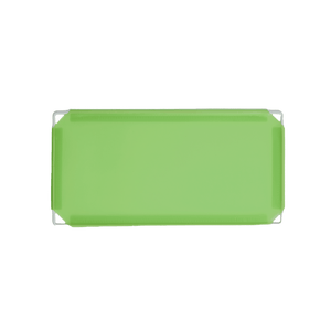






























![Square Panel [24 Pack] (35cm / 13.8in) Add-on](http://artistbooths.com/cdn/shop/files/Bulk_thumbnails-14.png?v=1782275611&width=320)
![Self Serve Hook with wire grid T clip 8cm [10 pack] Add-on](http://artistbooths.com/cdn/shop/files/artistbooths-booth-garage-t-section-self-serve-grid-hook-8cm-10pcs-1234044856.png?v=1776916212&width=320)
![Self serve display Grid & Intersection Hook expansion pack [12/24 Mixed pack] Add-on](http://artistbooths.com/cdn/shop/files/artistbooths-booth-garage-12-pack-2-grid-10-hooks-self-serve-display-grid-intersection-hook-expansion-pack-12-24-mixed-pcs-1234209872.png?v=1777005938&width=320)
![Multi Connector Expansion Pack - White - Bundle & Save [16/32 mixed pack] Add-on](http://artistbooths.com/cdn/shop/files/artistbooths-booth-garage-16-mixed-connector-pro-pack-connector-pro-expansion-pack-white-bundle-save-16-32-mixed-pcs-1234209875.png?v=1777005971&width=320)

![Mini Rectangle Panels [5-Pack] (17cm x 35cm/6.69in x 13.78in) Add-on](http://artistbooths.com/cdn/shop/files/artistbooths-booth-garage-frosted-amber-yellow-pms-1235-c-half-squares-10-pack-17cm-6-69in-1229850280.png?v=1774848457&width=320)
![Foot Connector Expansion Pack [4 Pcs] Add-on](http://artistbooths.com/cdn/shop/files/artistbooths-booth-garage-white-foot-connector-4-pcs-1233353183.png?v=1776908318&width=320)
![Mixed Single & Double Wire Shelf Clip [9 pack] Add-on](http://artistbooths.com/cdn/shop/files/mixed-single-double-wire-shelf-clip-9-pack_0c6e301c-8a76-411c-962a-8bf135de46c4.png?v=1792031372&width=320)
![Booth Wheel & Wheel Connector - white - [4 pack] Add-on](http://artistbooths.com/cdn/shop/files/artistbooths-booth-garage-booth-wheel-4pcs-wheel-connector-4-pcs-white-1234044880.png?v=1776916093&width=320)
![Corner Connector Expansion Pack [8 pack] Add-on](http://artistbooths.com/cdn/shop/files/artistbooths-booth-garage-white-corner-connector-expansion-pack-4-pcs-1234044868.png?v=1776915937&width=320)
![Edge Connector [8 pack] Add-on](http://artistbooths.com/cdn/shop/files/artistbooths-booth-garage-white-edge-connector-4-pcs-1234044876.png?v=1776915671&width=320)
![Single Shelf Wire Clip White [5 pack] Add-on](http://artistbooths.com/cdn/shop/files/artistbooths-booth-garage-single-shelf-wire-clip-white-5pcs-1234044883.png?v=1776915612&width=320)
![Double shelf wire clip white [4 pack] Add-on](http://artistbooths.com/cdn/shop/files/artistbooths-booth-garage-white-double-shelf-wire-clip-4-pack-1233353188.png?v=1776771613&width=320)
![Self serve display Grid & Fold Hook expansion pack [12/24 Mixed pack] Add-on](http://artistbooths.com/cdn/shop/files/artistbooths-booth-garage-12-pack-2-grid-10-fold-hooks-self-serve-display-grid-fold-hook-expansion-pack-12-24-mixed-pcs-1234209869.png?v=1777005852&width=320)
![Foldable Self Serve Hook (with wire clip) - [20 pack] Add-on](http://artistbooths.com/cdn/shop/files/artistbooths-booth-garage-white-foldable-self-serve-hook-wire-clip-version-10-pcs-1234214602.png?v=1777016318&width=320)
![Foldable Self Serve Hooks (with adhesive sheet) [20 pack] Add-on](http://artistbooths.com/cdn/shop/files/artistbooths-booth-garage-white-foldable-self-serve-hooks-adhesive-version-10-pcs-1234214609.png?v=1777016200&width=320)
![Metal mallet (with dual rubber/soft tap sides) [1 pc] Add-on](http://artistbooths.com/cdn/shop/files/artistbooths-bundle-component-dual-headed-metal-mallet-with-soft-tap-side-1209303104.png?v=1764380999&width=320)
![Panel Clamp Black 3cm Mouth [4 pcs] Add-on](http://artistbooths.com/cdn/shop/files/artistbooths-booth-garage-panel-clamp-2-pcs-1233843253.png?v=1776843493&width=320)