Your table sign is one of the few things every single person walking by will actually read, even the ones who don't stop. That's a lot of pressure for one small piece of foam board or acrylic. And it's also why so many artists get it wrong in one of two directions: either it says nothing useful, or it says way too much and nobody reads any of it.
What actually needs to be on there
Think of your sign as answering the one question a stranger has as they walk past at a normal pace: what is this and can I afford it. That's it. Everything else is secondary.
- Your name or shop name, in a font people can read from six feet away, not a hand-lettered logo that only works up close.
- A starting price or price range. "Prints from $10" tells people instantly whether to stop. Leaving price off entirely makes people assume it's expensive, which loses you sales from budget shoppers who'd have bought a sticker.
- What you sell, in plain words, if it isn't obvious from your display. "Original watercolor paintings" does more work than your logo alone.
That's genuinely most of it. If someone stops and wants more, that's what conversation and your product catalog are for.
What to skip
The instinct is to cram everything you can onto the sign because you paid for the printing and you want people to know everything about you. Resist it. A sign with eight different pieces of information competing for attention gets read as zero pieces of information, because nobody's eyes know where to land first.
- Your full artist statement. Nobody's reading three paragraphs while walking past a table.
- A list of every social platform you're on. Pick one, maybe two, and make it small.
- Tiny disclaimers and policy text. Put that on a card at eye level near the register instead, where people who are already engaged can actually read it.
- Too many fonts or colors fighting each other. If you can't read it from eight feet away in three seconds, it's too busy.
Size and placement matter more than design
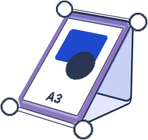
A beautifully designed sign that's propped flat on the table, hidden behind your prints, does nothing. Vertical placement wins almost every time: a sign standing up, clipped to your backdrop, or hanging above eye level catches people from across the aisle instead of only the people already standing at your table.
This is the same logic a lot of alley veterans push for displays generally: vertical beats flat on the table because it catches eyes from further away and doesn't compete with everything already sitting on your table surface. Your main sign should live in that same vertical real estate, not down at elbow height where it's easy to miss.
A simple sign hierarchy
| Priority | Content | Size |
|---|---|---|
| 1 | Shop name | Largest, top of sign |
| 2 | What you sell / starting price | Medium, clearly visible |
| 3 | One social handle (optional) | Small, bottom corner |
Signs for different parts of your table
Your main sign isn't the only sign you'll need. Small price cards on individual product categories (stickers here, prints there) do more to move people through your table than one big sign ever will, because they answer the price question right where someone's already looking. A commission price list, if you take them, is worth its own small dedicated sign rather than being squeezed onto your main one.
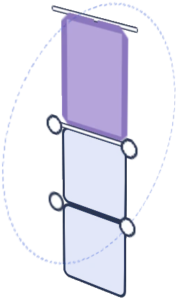
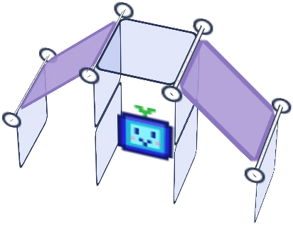
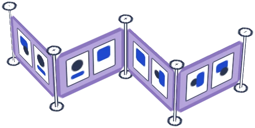
If you're running a taller setup with more panel space, like a Shapeshift or Duo build, you've got the vertical surface to give your main sign real prominence up top and still leave room for smaller category signs at eye level lower down. Worth planning where each sign goes before you're taping things up at 8am on setup day.
Simple wins here. If you're not sure whether something belongs on the sign, it probably doesn't.
Curious what a Shapeshift kit actually looks like in person? Head to the Artist Booths homepage to see the full lineup and find the one that fits your table.

![Artistbooths Bundle Component Frosted Lavender Purple (PMS 2715 C) Panel Square (35x35 cm) [8-pack]](http://artistbooths.com/cdn/shop/files/artistbooths-bundle-component-frosted-lavender-purple-pms-2715-c-boof-panel-square-35x35-cm-8-pack-1214015634.png?v=1767318728&width=300)




![Artistbooths Bundle Component Frosted Lilac Purple (PMS 263 C) BOOF Panel Triangle (35x35 cm) [2-pack]](http://artistbooths.com/cdn/shop/files/artistbooths-bundle-component-frosted-lilac-purple-pms-263-c-boof-panel-triangle-35x35-cm-2-pack-1214015625.png?v=1767318428&width=300)



































![Square Panel [24 Pack] (35cm / 13.8in) Add-on](http://artistbooths.com/cdn/shop/files/Bulk_thumbnails-14.png?v=1782275611&width=320)
![Self Serve Hook with wire grid T clip 8cm [10 pack] Add-on](http://artistbooths.com/cdn/shop/files/artistbooths-booth-garage-t-section-self-serve-grid-hook-8cm-10pcs-1234044856.png?v=1776916212&width=320)
![Self serve display Grid & Intersection Hook expansion pack [12/24 Mixed pack] Add-on](http://artistbooths.com/cdn/shop/files/artistbooths-booth-garage-12-pack-2-grid-10-hooks-self-serve-display-grid-intersection-hook-expansion-pack-12-24-mixed-pcs-1234209872.png?v=1777005938&width=320)
![Multi Connector Expansion Pack - White - Bundle & Save [16/32 mixed pack] Add-on](http://artistbooths.com/cdn/shop/files/artistbooths-booth-garage-16-mixed-connector-pro-pack-connector-pro-expansion-pack-white-bundle-save-16-32-mixed-pcs-1234209875.png?v=1777005971&width=320)

![Mini Rectangle Panels [5-Pack] (17cm x 35cm/6.69in x 13.78in) Add-on](http://artistbooths.com/cdn/shop/files/artistbooths-booth-garage-frosted-amber-yellow-pms-1235-c-half-squares-10-pack-17cm-6-69in-1229850280.png?v=1774848457&width=320)
![Foot Connector Expansion Pack [4 Pcs] Add-on](http://artistbooths.com/cdn/shop/files/artistbooths-booth-garage-white-foot-connector-4-pcs-1233353183.png?v=1776908318&width=320)
![Mixed Single & Double Wire Shelf Clip [9 pack] Add-on](http://artistbooths.com/cdn/shop/files/mixed-single-double-wire-shelf-clip-9-pack_0c6e301c-8a76-411c-962a-8bf135de46c4.png?v=1792031372&width=320)
![Booth Wheel & Wheel Connector - white - [4 pack] Add-on](http://artistbooths.com/cdn/shop/files/artistbooths-booth-garage-booth-wheel-4pcs-wheel-connector-4-pcs-white-1234044880.png?v=1776916093&width=320)
![Corner Connector Expansion Pack [8 pack] Add-on](http://artistbooths.com/cdn/shop/files/artistbooths-booth-garage-white-corner-connector-expansion-pack-4-pcs-1234044868.png?v=1776915937&width=320)
![Edge Connector [8 pack] Add-on](http://artistbooths.com/cdn/shop/files/artistbooths-booth-garage-white-edge-connector-4-pcs-1234044876.png?v=1776915671&width=320)
![Single Shelf Wire Clip White [5 pack] Add-on](http://artistbooths.com/cdn/shop/files/artistbooths-booth-garage-single-shelf-wire-clip-white-5pcs-1234044883.png?v=1776915612&width=320)
![Double shelf wire clip white [4 pack] Add-on](http://artistbooths.com/cdn/shop/files/artistbooths-booth-garage-white-double-shelf-wire-clip-4-pack-1233353188.png?v=1776771613&width=320)
![Self serve display Grid & Fold Hook expansion pack [12/24 Mixed pack] Add-on](http://artistbooths.com/cdn/shop/files/artistbooths-booth-garage-12-pack-2-grid-10-fold-hooks-self-serve-display-grid-fold-hook-expansion-pack-12-24-mixed-pcs-1234209869.png?v=1777005852&width=320)
![Foldable Self Serve Hook (with wire clip) - [20 pack] Add-on](http://artistbooths.com/cdn/shop/files/artistbooths-booth-garage-white-foldable-self-serve-hook-wire-clip-version-10-pcs-1234214602.png?v=1777016318&width=320)
![Foldable Self Serve Hooks (with adhesive sheet) [20 pack] Add-on](http://artistbooths.com/cdn/shop/files/artistbooths-booth-garage-white-foldable-self-serve-hooks-adhesive-version-10-pcs-1234214609.png?v=1777016200&width=320)
![Metal mallet (with dual rubber/soft tap sides) [1 pc] Add-on](http://artistbooths.com/cdn/shop/files/artistbooths-bundle-component-dual-headed-metal-mallet-with-soft-tap-side-1209303104.png?v=1764380999&width=320)
![Panel Clamp Black 3cm Mouth [4 pcs] Add-on](http://artistbooths.com/cdn/shop/files/artistbooths-booth-garage-panel-clamp-2-pcs-1233843253.png?v=1776843493&width=320)