Some booths look great until you really look at them. Something is off but you cannot put your finger on it. It just feels... unfinished. Like a room that is missing one piece of furniture. Here are the aesthetic mistakes that create that feeling.
Visible storage under the table. Nothing kills the illusion faster than a customer glancing down and seeing cardboard boxes, plastic bins, and crumpled bags stuffed under your tablecloth. Either get a cloth that reaches the floor or use opaque containers that look intentional. Your booth ends at the ground, not at the table edge.
Mixed display materials. Half your prints are in plastic sleeves pinned to a corkboard. The other half are on a modular display kit with clean panel shelving. The modular half looks professional. The corkboard half looks like a dorm room. Pick one display system and commit. Mixing reads as "I ran out of shelves," which reads as "I did not plan this."
No breathing room between products. Every centimetre of table space is covered. Prints overlap. Stickers touch. There is no gap anywhere. This is not abundance. This is overwhelm. Leave at least 2-3cm between items. The white space is not wasted space. It is the thing that makes each piece readable.
Mismatched price tags. Some are handwritten on sticky notes. Some are printed. Some are different sizes. Price tags are the most-read text in your booth besides your banner. If they look thrown together, the whole booth inherits that energy. Print them all the same way, same size, same font. Takes 20 minutes at home and changes everything.
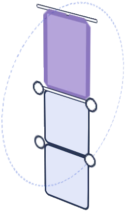
The empty top shelf. You have a vertical display with three levels and the top one has... one print and a lot of empty panel. Top-level displays are the first thing visible from a distance. An empty or sparse top shelf makes your booth look under-stocked even if the table is loaded. Fill it or remove the shelf entirely. Browse the full kit range for configurations that match your actual inventory volume so you do not over-build.
The wrong tablecloth colour. It clashes with your panels, your art, or both. Or worse, it is clearly a bedsheet you grabbed this morning. Your tablecloth is the single biggest colour field in your booth. It deserves a deliberate choice. Spend $15 on one that coordinates with your display. That is the cheapest upgrade with the biggest visual impact.
No focal point. Every piece is displayed at the same size, same height, same priority. The eye enters the booth and has no idea where to go first. Pick one hero piece. Display it larger, higher, or more prominently than everything else. That is your anchor. Everything else supports it.
Cables and chargers in the sightline. Your phone charger snaking across the table. An extension cord looping behind your display. A power strip visible at floor level. Tape them down. Route them behind panels. Use wireless charging. Every cable is a crack in the illusion that this is a curated space rather than a temporary setup.

![Artistbooths Bundle Component Frosted Lavender Purple (PMS 2715 C) Panel Square (35x35 cm) [8-pack]](http://artistbooths.com/cdn/shop/files/artistbooths-bundle-component-frosted-lavender-purple-pms-2715-c-boof-panel-square-35x35-cm-8-pack-1214015634.png?v=1767318728&width=300)




![Artistbooths Bundle Component Frosted Lilac Purple (PMS 263 C) BOOF Panel Triangle (35x35 cm) [2-pack]](http://artistbooths.com/cdn/shop/files/artistbooths-bundle-component-frosted-lilac-purple-pms-263-c-boof-panel-triangle-35x35-cm-2-pack-1214015625.png?v=1767318428&width=300)



































![Square Panel [24 Pack] (35cm / 13.8in) Add-on](http://artistbooths.com/cdn/shop/files/Bulk_thumbnails-14.png?v=1782275611&width=320)
![Self Serve Hook with wire grid T clip 8cm [10 pack] Add-on](http://artistbooths.com/cdn/shop/files/artistbooths-booth-garage-t-section-self-serve-grid-hook-8cm-10pcs-1234044856.png?v=1776916212&width=320)
![Self serve display Grid & Intersection Hook expansion pack [12/24 Mixed pack] Add-on](http://artistbooths.com/cdn/shop/files/artistbooths-booth-garage-12-pack-2-grid-10-hooks-self-serve-display-grid-intersection-hook-expansion-pack-12-24-mixed-pcs-1234209872.png?v=1777005938&width=320)
![Multi Connector Expansion Pack - White - Bundle & Save [16/32 mixed pack] Add-on](http://artistbooths.com/cdn/shop/files/artistbooths-booth-garage-16-mixed-connector-pro-pack-connector-pro-expansion-pack-white-bundle-save-16-32-mixed-pcs-1234209875.png?v=1777005971&width=320)

![Mini Rectangle Panels [5-Pack] (17cm x 35cm/6.69in x 13.78in) Add-on](http://artistbooths.com/cdn/shop/files/artistbooths-booth-garage-frosted-amber-yellow-pms-1235-c-half-squares-10-pack-17cm-6-69in-1229850280.png?v=1774848457&width=320)
![Foot Connector Expansion Pack [4 Pcs] Add-on](http://artistbooths.com/cdn/shop/files/artistbooths-booth-garage-white-foot-connector-4-pcs-1233353183.png?v=1776908318&width=320)
![Mixed Single & Double Wire Shelf Clip [9 pack] Add-on](http://artistbooths.com/cdn/shop/files/mixed-single-double-wire-shelf-clip-9-pack_0c6e301c-8a76-411c-962a-8bf135de46c4.png?v=1792031372&width=320)
![Booth Wheel & Wheel Connector - white - [4 pack] Add-on](http://artistbooths.com/cdn/shop/files/artistbooths-booth-garage-booth-wheel-4pcs-wheel-connector-4-pcs-white-1234044880.png?v=1776916093&width=320)
![Corner Connector Expansion Pack [8 pack] Add-on](http://artistbooths.com/cdn/shop/files/artistbooths-booth-garage-white-corner-connector-expansion-pack-4-pcs-1234044868.png?v=1776915937&width=320)
![Edge Connector [8 pack] Add-on](http://artistbooths.com/cdn/shop/files/artistbooths-booth-garage-white-edge-connector-4-pcs-1234044876.png?v=1776915671&width=320)
![Single Shelf Wire Clip White [5 pack] Add-on](http://artistbooths.com/cdn/shop/files/artistbooths-booth-garage-single-shelf-wire-clip-white-5pcs-1234044883.png?v=1776915612&width=320)
![Double shelf wire clip white [4 pack] Add-on](http://artistbooths.com/cdn/shop/files/artistbooths-booth-garage-white-double-shelf-wire-clip-4-pack-1233353188.png?v=1776771613&width=320)
![Self serve display Grid & Fold Hook expansion pack [12/24 Mixed pack] Add-on](http://artistbooths.com/cdn/shop/files/artistbooths-booth-garage-12-pack-2-grid-10-fold-hooks-self-serve-display-grid-fold-hook-expansion-pack-12-24-mixed-pcs-1234209869.png?v=1777005852&width=320)
![Foldable Self Serve Hook (with wire clip) - [20 pack] Add-on](http://artistbooths.com/cdn/shop/files/artistbooths-booth-garage-white-foldable-self-serve-hook-wire-clip-version-10-pcs-1234214602.png?v=1777016318&width=320)
![Foldable Self Serve Hooks (with adhesive sheet) [20 pack] Add-on](http://artistbooths.com/cdn/shop/files/artistbooths-booth-garage-white-foldable-self-serve-hooks-adhesive-version-10-pcs-1234214609.png?v=1777016200&width=320)
![Metal mallet (with dual rubber/soft tap sides) [1 pc] Add-on](http://artistbooths.com/cdn/shop/files/artistbooths-bundle-component-dual-headed-metal-mallet-with-soft-tap-side-1209303104.png?v=1764380999&width=320)
![Panel Clamp Black 3cm Mouth [4 pcs] Add-on](http://artistbooths.com/cdn/shop/files/artistbooths-booth-garage-panel-clamp-2-pcs-1233843253.png?v=1776843493&width=320)