We've seen brilliant artists with terrible signage lose foot traffic to mediocre artists with clean, readable signs. It happens at every convention. And the worst part is that bad signage is one of the easiest problems to fix.
The biggest mistake is using tiny text. Your booth name in 24-point font on an A4 sheet of paper. Who is that for? Someone already standing at your table? They already know they're at your table. Your signage needs to work from 10 metres away, and that means LARGE type. Minimum 5cm letter height for your name, visible from across an aisle. Mount it at the top of your display where it clears the crowd.
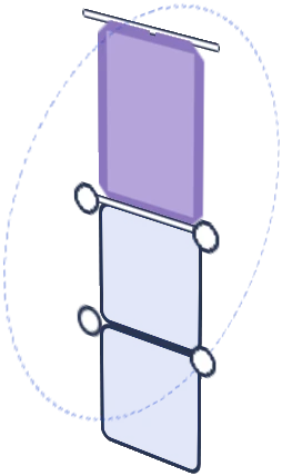
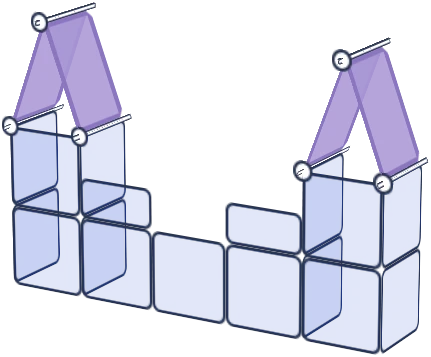
A modular display kit standing 175cm gives you a natural signage position above head height. That top row of panels is prime real estate for your brand name. Use it. A printed banner, a vinyl cut, even a clean hand-painted sign mounted to the top panels works. What doesn't work is leaving that space empty while your name sits at table level where nobody walking past can see it.
Second mistake: too many signs. Price list here, policies there, social media handle on a card, a "commissions open" notice, a fandom label for each section. Every sign dilutes the next one. Your brain can process maybe 2-3 text elements in a quick glance. Everything beyond that becomes noise. Pick your essentials: brand name (visible far away), prices (visible up close), and maybe one call to action. That's it.
Third: fonts that are pretty but unreadable. Script fonts, ultra-thin weights, decorative typefaces that look gorgeous on your business card but turn into squiggly lines from any distance. At conventions, readability beats aesthetics every time. A clean sans-serif in bold weight communicates faster than any fancy font.
Here's the test we recommend. Set up your display at home, walk to the other side of the room, and try to read your signage. If you have to squint, it's too small. If you can't tell what it says, change the font. If you're not sure which sign to look at first, you have too many. Fix those three things and you'll notice more people actually stopping. Browse the full kit range to find the right display height for your signage.

![Artistbooths Bundle Component Frosted Lavender Purple (PMS 2715 C) Panel Square (35x35 cm) [8-pack]](http://artistbooths.com/cdn/shop/files/artistbooths-bundle-component-frosted-lavender-purple-pms-2715-c-boof-panel-square-35x35-cm-8-pack-1214015634.png?v=1767318728&width=300)




![Artistbooths Bundle Component Frosted Lilac Purple (PMS 263 C) BOOF Panel Triangle (35x35 cm) [2-pack]](http://artistbooths.com/cdn/shop/files/artistbooths-bundle-component-frosted-lilac-purple-pms-263-c-boof-panel-triangle-35x35-cm-2-pack-1214015625.png?v=1767318428&width=300)




































![Square Panel [24 Pack] (35cm / 13.8in) Add-on](http://artistbooths.com/cdn/shop/files/Bulk_thumbnails-14.png?v=1782275611&width=320)
![Self Serve Hook with wire grid T clip 8cm [10 pack] Add-on](http://artistbooths.com/cdn/shop/files/artistbooths-booth-garage-t-section-self-serve-grid-hook-8cm-10pcs-1234044856.png?v=1776916212&width=320)
![Self serve display Grid & Intersection Hook expansion pack [12/24 Mixed pack] Add-on](http://artistbooths.com/cdn/shop/files/artistbooths-booth-garage-12-pack-2-grid-10-hooks-self-serve-display-grid-intersection-hook-expansion-pack-12-24-mixed-pcs-1234209872.png?v=1777005938&width=320)
![Multi Connector Expansion Pack - White - Bundle & Save [16/32 mixed pack] Add-on](http://artistbooths.com/cdn/shop/files/artistbooths-booth-garage-16-mixed-connector-pro-pack-connector-pro-expansion-pack-white-bundle-save-16-32-mixed-pcs-1234209875.png?v=1777005971&width=320)

![Mini Rectangle Panels [5-Pack] (17cm x 35cm/6.69in x 13.78in) Add-on](http://artistbooths.com/cdn/shop/files/artistbooths-booth-garage-frosted-amber-yellow-pms-1235-c-half-squares-10-pack-17cm-6-69in-1229850280.png?v=1774848457&width=320)
![Foot Connector Expansion Pack [4 Pcs] Add-on](http://artistbooths.com/cdn/shop/files/artistbooths-booth-garage-white-foot-connector-4-pcs-1233353183.png?v=1776908318&width=320)
![Mixed Single & Double Wire Shelf Clip [9 pack] Add-on](http://artistbooths.com/cdn/shop/files/mixed-single-double-wire-shelf-clip-9-pack_0c6e301c-8a76-411c-962a-8bf135de46c4.png?v=1792031372&width=320)
![Booth Wheel & Wheel Connector - white - [4 pack] Add-on](http://artistbooths.com/cdn/shop/files/artistbooths-booth-garage-booth-wheel-4pcs-wheel-connector-4-pcs-white-1234044880.png?v=1776916093&width=320)
![Corner Connector Expansion Pack [8 pack] Add-on](http://artistbooths.com/cdn/shop/files/artistbooths-booth-garage-white-corner-connector-expansion-pack-4-pcs-1234044868.png?v=1776915937&width=320)
![Edge Connector [8 pack] Add-on](http://artistbooths.com/cdn/shop/files/artistbooths-booth-garage-white-edge-connector-4-pcs-1234044876.png?v=1776915671&width=320)
![Single Shelf Wire Clip White [5 pack] Add-on](http://artistbooths.com/cdn/shop/files/artistbooths-booth-garage-single-shelf-wire-clip-white-5pcs-1234044883.png?v=1776915612&width=320)
![Double shelf wire clip white [4 pack] Add-on](http://artistbooths.com/cdn/shop/files/artistbooths-booth-garage-white-double-shelf-wire-clip-4-pack-1233353188.png?v=1776771613&width=320)
![Self serve display Grid & Fold Hook expansion pack [12/24 Mixed pack] Add-on](http://artistbooths.com/cdn/shop/files/artistbooths-booth-garage-12-pack-2-grid-10-fold-hooks-self-serve-display-grid-fold-hook-expansion-pack-12-24-mixed-pcs-1234209869.png?v=1777005852&width=320)
![Foldable Self Serve Hook (with wire clip) - [20 pack] Add-on](http://artistbooths.com/cdn/shop/files/artistbooths-booth-garage-white-foldable-self-serve-hook-wire-clip-version-10-pcs-1234214602.png?v=1777016318&width=320)
![Foldable Self Serve Hooks (with adhesive sheet) [20 pack] Add-on](http://artistbooths.com/cdn/shop/files/artistbooths-booth-garage-white-foldable-self-serve-hooks-adhesive-version-10-pcs-1234214609.png?v=1777016200&width=320)
![Metal mallet (with dual rubber/soft tap sides) [1 pc] Add-on](http://artistbooths.com/cdn/shop/files/artistbooths-bundle-component-dual-headed-metal-mallet-with-soft-tap-side-1209303104.png?v=1764380999&width=320)
![Panel Clamp Black 3cm Mouth [4 pcs] Add-on](http://artistbooths.com/cdn/shop/files/artistbooths-booth-garage-panel-clamp-2-pcs-1233843253.png?v=1776843493&width=320)