Artist Back Alley Resources Blog

The Aesthetic Upgrade That Costs Nothing But Planning

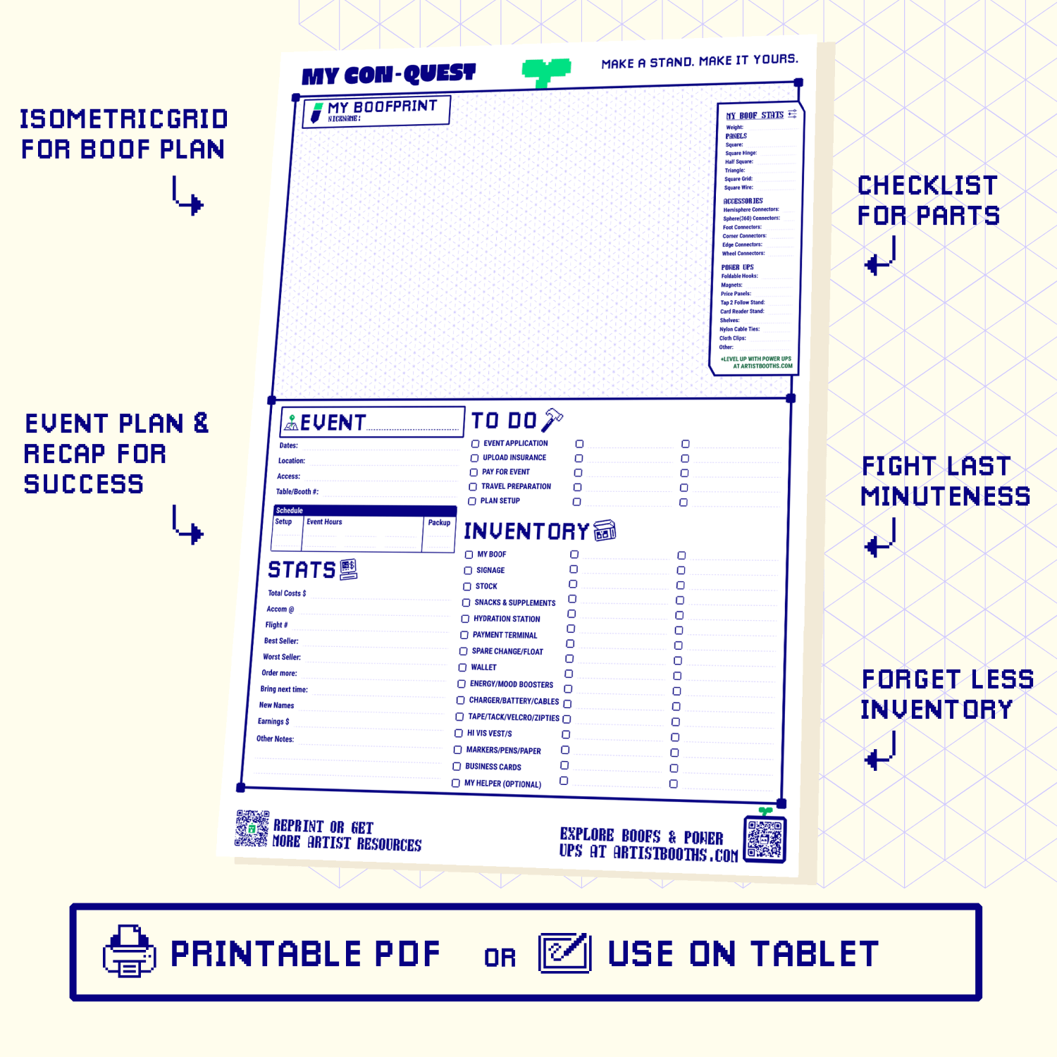
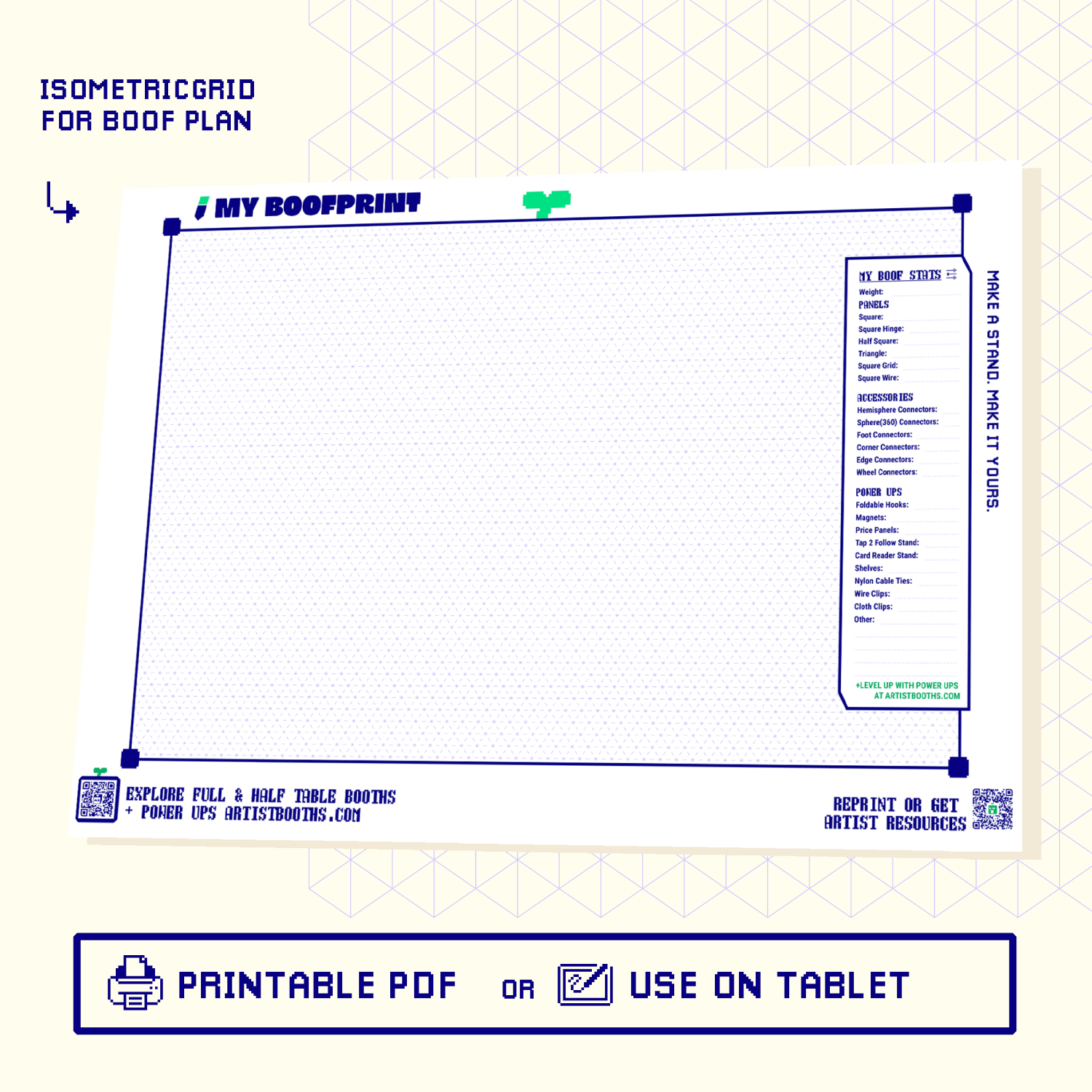
Your Booth Aesthetic Starts Before You Buy Anything Most vendors think a great-looking booth starts with buying things. Better display. Nicer tablecloth. Fancier signage. And sure, all of that helps. But the single biggest aesthetic upgrade you can make costs absolutely nothing. It's planning. Specifically, planning what goes WHERE and WHY before you set foot at your next event. Map Your Table Like A Floor Plan Grab a piece of paper. Draw your table from above. Now place every product category in a zone. Prints on the left wall. Stickers front and centre. Originals on the back panel. Small impulse buys near the register. This isn't interior design school. It's crowd flow. People approach from the front, scan left to right (in most Western markets), and reach for what's at hand height. Put your hero pieces where eyes land first. Put your cheapest impulse items where hands land last. A modular display kit makes this easier because the panels give you distinct vertical zones. Five panels high at 175cm means you can layer: eye-level showcase, mid-level browse, table-level grab. Pick A Colour Story And Stick To It Two to three colours. That's it. Your panels, your tablecloth, your signage, your business cards. All pulling from the same palette. This reads as "curated" to customers even if you assembled it in twenty minutes. The trap is variety. You have 19+ panel colours to choose from in the full kit range. The temptation is to use six of them. Resist. Constraints create cohesion. Decide What Not To Show This is the hard one. You made fifty pieces. You want to show fifty pieces. But a booth with fifty things on display looks like a garage sale, not a gallery. Edit ruthlessly. Bring your top twenty. Keep backstock in boxes under the table for restocking. The booth that shows less but shows it WELL outsells the cluttered one almost every time. Test Your Layout At Home First Set up your table in your living room. Stand six feet back. Can you see your hero piece? Is there breathing room between items? Does the eye know where to go? Take a photo. Look at it on your phone. If it looks good as a thumbnail, it'll stop foot traffic at a market. If it looks busy as a thumbnail, it'll get walked past. Frequently Asked Questions How Long Does Planning A Layout Take? About an hour for your first time. After that, maybe fifteen minutes of tweaking between events. The initial investment pays off for months. Do I Need To Buy New Display Gear To Make This Work? No. The whole point is that planning is free. Better placement of what you already own beats an expensive display with bad arrangement. Upgrade the gear later once you know your layout works. What If My Products Are All Different Sizes? Group by visual weight, not by category. Three small items clustered together balance one large piece across the table. The modular panel system helps here because you can adjust shelf heights to fit mixed sizes without everything looking chaotic.

Why Neutral Backdrops Make Colourful Art Pop Harder

We're going to say something that sounds counterintuitive. If your art is colourful, your booth should be boring. Not boring as in lazy. Boring as in neutral. White. Frosted. Maybe a soft grey. A backdrop that does absolutely nothing on its own. Because when your backdrop does nothing, your art does everything. We've watched hundreds of booths at conventions and the pattern is CLEAR. The artists with the most vibrant, colourful work who put it on colourful panel walls? Their tables turn into visual noise. Every colour fights every other colour. The eye doesn't know where to land. The customer's brain goes "that's a lot" and their feet keep walking. The same art on a white or frosted wall from a modular display kit? Each piece gets to be the loudest thing in its own space. The white acts like a gallery. And galleries know what they're doing. There's a reason the Louvre doesn't paint its walls hot pink. This isn't about playing it safe. This is about understanding that your display wall is a FRAME, not a second piece of art. A frame's job is to make the thing inside it look better. A frame that demands its own attention is a bad frame. Doesn't matter how nice the colour is on its own. If you're an artist whose work is already doing heavy visual lifting (bright palettes, high saturation, lots of detail), give it a quiet stage. Grab a neutral kit from the full kit range. Build a clean wall. Let the work speak without a backdrop competing for the same attention. Your art is already the show. Stop making your booth audition for the same role.

Designing Your Display Around Your Logo, Not The Other Way Around

Most artists design their logo first. Then they try to make their booth match it. This sounds logical but it's backwards. Your display is the biggest canvas you own. Your logo is a small mark that sits inside it. Design the space first. Let the logo live in it, not fight it. Here's how to build a modular display that makes your logo feel at home instead of forcing your whole booth to serve a 10cm graphic. Your Logo Is A Detail, Not The Main Character Walk any convention floor and you'll see it. Artists who plastered their logo across a massive banner and then built a random assortment of products underneath it. The logo screams. The booth whispers. They don't match. Your logo should feel like it belongs in your booth, not like it's trying to overpower it. If your logo uses navy and gold, your panel wall in navy already echoes the brand. The logo becomes a natural accent on a small sign or card. Not a billboard desperately trying to create brand recognition on its own. Extract The Palette, Not The Graphic Your logo has a colour palette. That palette is the bridge between a small graphic and a full booth environment. Pull your two dominant logo colours. Use the primary as your panel wall colour. Use the secondary on your tablecloth, signage, or packaging. Example: your logo is teal text on a white background. Your booth becomes white panels (from the full kit range) with teal accents on your business cards, price tags, and table runner. The logo sits small on a card stand. But the teal repeats EVERYWHERE at a subtle level. That's cohesion. That's what makes someone say "this booth feels like a brand." Let Your Display Shape Inform Your Brand Elements The 35x35cm panel grid creates a visual rhythm. Straight lines. Clean edges. A modular, geometric feel. If your logo is organic and flowing, that contrast can look great. But it means your logo should sit on a simple white card or banner, not try to wrap around the panels. If your logo is geometric and clean, lean into the grid. Let it echo the panel lines. Place it centred on a top panel or at eye level on a side return. The grid does the design work for you. The key insight: your booth's physical structure IS a design element. Work with it instead of trying to override it with printed materials. Frequently Asked Questions Should I put my logo directly on a panel? You can, with a vinyl sticker or a small printed card hung from a PLA hook. But don't cover multiple panels with one giant logo. It fights the grid and usually looks worse than a small, well-placed mark at eye level. What if my logo colours don't match any available panel colours? Go neutral. White or frosted panels work with every logo palette. Use your brand colours on your table surface, signage, and packaging instead. The panels become a clean backdrop that lets everything else carry the brand. My logo has five colours. Which ones do I use for my booth? Pick the two most dominant. Five-colour booths look chaotic. Two colours plus your art is plenty. Let the other three logo colours live in your printed materials where they're seen up close, not across a convention hall.

The Psychology Of Colour At An Artist Alley Table

You probably haven't thought about why certain booths make you stop walking. It's not always the art. Sometimes it's the colour of the space around the art. Colour psychology isn't just a marketing buzzword. It's the reason some tables pull foot traffic and others get walked past. Understanding how colour works at a crowded convention or market can help you make smarter choices about your modular display kit setup. Not theory-smart. Sales-smart. Warm Colours Pull, Cool Colours Hold Warm colours like coral, orange, and red are attention-grabbers. They trigger urgency and energy. In a busy aisle, a warm-toned booth wall registers in peripheral vision faster than a cool one. People notice it before they decide to notice it. Cool colours like navy, teal, and lilac do the opposite. They calm people down. They make a space feel comfortable and curated. People who stop at a cool-toned booth tend to stay LONGER. They browse more. They feel less rushed. Neither is better. It depends on what you're selling and how you sell. High-energy merch (stickers, pins, fandom stuff)? Warm backdrop. Fine art prints, journals, or hand-crafted goods? Cool backdrop. Match the colour temperature to the buying energy you want. Contrast Is More Important Than The Specific Colour Here's the part most artists miss. The specific colour of your panels matters less than the contrast between your panels and your art. Bright, colourful art on a white or light panel wall? Strong contrast. Every piece pops. The wall disappears and the art takes centre stage. Dark, moody art on a black panel wall? Low contrast. The booth feels like a single immersive space. The art and the environment merge. This works brilliantly for atmosphere but your individual pieces need strong lighting or framing to stand out. The worst combo is medium-toned art on a medium-toned wall. Everything flattens. Nothing pops. If your art lives in the midtones, go hard in one direction with your panels. Bright white or deep dark. Force the contrast. The Colour Your Neighbours Use Matters Too You don't control who sets up next to you. But you can anticipate it. At most conventions, the majority of booths run white, grey, or bare table. If you show up with a deep navy or coral wall from the full kit range, you're visually distinct from both neighbours almost guaranteed. This is another reason the two-colour rule works. Your dominant colour handles the contrast job. Your accent colour adds personality without creating visual noise that blends into the chaos around you. Frequently Asked Questions What's the safest colour if I'm unsure? White or frosted. They work with every art style, maximise contrast for colourful pieces, and look clean in photos. You can always add an accent colour later when you know your brand better. Does panel colour affect how my products photograph? Yes. Significantly. White panels reflect light and brighten your products in photos. Dark panels absorb light and create a moodier frame. If you rely heavily on social media sales from con photos, factor in how your panel colour photographs under fluorescent convention lighting.

Building A Booth Aesthetic On A First-Timer Budget

Your first con is coming up. You have art to sell and a table reserved. But your setup budget is basically whatever's left after printing costs. Sound familiar? Good news. Building a booth that looks polished doesn't require spending big. It requires spending smart. Here's how to build a display aesthetic on a first-timer budget that doesn't scream "this is my first time." Pick One Colour And Commit The fastest way to look put-together is colour consistency. Pick one panel colour for your modular display kit and stick with it. White is the safest starting point. It works with every art style and makes colours pop. Black adds drama. Frosted gives a modern, clean vibe without feeling sterile. Don't try to get clever with three colours on your first outing. One colour across your whole wall reads as intentional. Mixed colours on a budget read as "I grabbed whatever was cheapest." A Core kit gives you 24 panels. That's enough to build a backdrop wall 5 panels wide and 5 high (175cm tall) on a standard 180cm table. Minimal investment. Maximum impact for the money. Free Things That Elevate Your Setup Before you spend another dollar, do these: Iron or steam your tablecloth. Wrinkles are the number one thing that makes a table look amateur Group similar products together. Stickers in one zone, prints in another, originals separated Leave breathing room. Not every square centimetre needs to be covered. White space on a table works the same way it works in design Face your prints outward on the panel wall so people see them from the aisle, not from directly in front of you Where To Spend And Where To Save Spend on your vertical display. The wall behind you is the single biggest visual impact for the money. A kit from the full range sets up in under 30 minutes with no tools and packs flat into a 56x36x23cm case that fits carry-on. That's your most important purchase. Save on table accessories. You don't need custom acrylic risers for your first show. A stack of books under your tablecloth creates height variation for free. Small cardboard easels from a craft store hold prints for a few dollars. Save on signage. A clean price list printed at home on cardstock looks better than a cheap banner with clip-art flames. Keep it simple. Name, social handle, prices. Done. Frequently Asked Questions Is a Core kit (24 panels) enough for a first con? For a standard 6ft table, yes. You get a solid backdrop wall and enough panels to add a small side return if you want. Most first-timers don't need more display area than that. You're still building your product range. What if I can't afford a kit right now? Start with what you have and upgrade when you can. But know that a vertical display behind your table is the single highest-impact change you can make. It's visible from across the room. Flat table layouts are only visible to people who are already standing in front of you. Should I buy extra panels in a second colour? Not yet. Get comfortable with your setup first. After two or three cons you'll have a much better feel for what your booth needs. Then add accent panels deliberately instead of guessing.

Matching Panel Colours To Your Seasonal Drops

You drop a new collection every season. New characters, new colourways, new energy. But your booth still looks like last year. The panels are the same ones you grabbed in a rush before your first con. They work fine. They just don't match anymore. Matching your panel colours to your seasonal drops is one of the easiest ways to make your table feel intentional. And with 19+ colours available in the modular display kit, you can plan around your art instead of working against it. Start With Your Art, Not The Panels Pull up your next collection. What are the dominant tones? If you're launching a pastel spring line, frosted white or lilac panels will let those soft colours breathe. Dark fantasy drop? Navy or black panels push that mood hard without competing with your prints. The mistake most artists make is picking panel colours they personally like instead of colours that serve the work. Your booth is a frame. The art is the painting inside it. The Two-Colour Rule Stick to two panel colours max per setup. One dominant, one accent. A full wall of white with a single column of coral on the side? That reads as a deliberate choice. Five random colours? That reads as leftovers. With the full kit range, you can grab extra panels in a second colour without buying a whole new kit. Swap a column between seasons and your booth feels brand new for the cost of a few panels. Seasonal Swap Strategy Here's what works for artists who table regularly: Keep a neutral base kit (white, frosted, or light grey) that works year-round Buy one accent colour per major drop or season Rotate the accent panels into your side columns or top row Store off-season panels flat in the carry case. They're 35x35cm and stack clean This way you're never rebuilding from scratch. You're refreshing. Big visual difference, small effort. Frequently Asked Questions Can I mix panel colours from different kits? Yes. Every panel uses the same ABS connectors regardless of colour. Mix and match however you want. A Shapeshift (46 panels) in white plus 10 extra coral panels is a completely valid setup. How many panels do I need to swap for a noticeable change? Even replacing one column (5 panels high) makes a visible difference. For a stronger seasonal shift, swap 10 to 15 panels in your accent colour. That's roughly one side wall on a Core kit (24 panels). Do the colours fade over time? The frosted PP panels hold their colour well. They're not printed on. The colour runs through the material. So even after dozens of cons they still look fresh.
60-second quizExtra 5% off

Find your ideal display kit size in 60 seconds & score extra 5% off

What are your planned setups going to be?
Half table (90cm / 3ft)
Sharing a table or just starting out
Full table (180cm / 6ft)
The standard table at most cons, markets & fairs
Double, corner or booth (360cm / 12ft)
Two tables, an L-shape, or a full corner stand
Free-standing booth (no table)
A floor-standing wall, no table needed
Select all that apply
How long do you plan to use it?
Just trying it out
1–3 times
Going to do markets more often
3–20 times/year
Multi-year use
Built to last, with room to grow
What do you display?
Small prints, cards, pins & stickers
Flat, lightweight, easy to pin
Large prints & posters
A2 and up, needs room to breathe
Large items: Apparel, bags, figures, 3D merch, home goods
Heavier, bulkier pieces that need sturdy shelf framing
Jewellery, charms & keychains
Small and light, lots of little hooks
Select all that apply
How tall do you want it?
Keep it low so my table and wall stay visible
A clean, low backdrop that frames your work
Build tall framing for maximum impact
A towering wall that pulls eyes from across the hall
Which colours catch your eye?
Amber Yellow
Apricot
Avocado Green
Blue Sky
Forest Green
Grape Purple
Jade Green
Lavender Purple
Lilac Purple
Mint Green
Royal Blue
Scarlet Red
Snow White
Terracotta
Watermelon Pink
Yuzu Yellow
Select all that apply
Your perfect kit and an extra 5% off are ready, pop in your email below to reveal both.
Unlock your kit & bonus 5% discount
Pop in your email and we'll reveal your extra 5% off, auto-applied at your cart.
Your result
Your perfect match
Your stall. Infinite installs.

Lightweight panels and snap on connectors shapeshift together.

Iron frame with frosted, water resistant surfaces for light & mighty structures.

Shapeshift kit part
Artistbooths Bundle Component Frosted Lavender Purple (PMS 2715 C) Panel Square (35x35 cm) [8-pack]
Shapeshift kit part
B-grade artist booth panel - discounted cosmetic-second stock
Shapeshift kit part
Shapeshift kit part
Artistbooths Bundle Component Frosted Lilac Purple (PMS 263 C) BOOF Panel Triangle (35x35 cm) [2-pack]
Shapeshift kit part
Shapeshift kit part
Shapeshift kit part
Shapeshift kit part
Shapeshift kit part
Artistbooths Bundle Component Frosted Lilac Purple (PMS 263 C) BOOF Panel Half Square (35x17.5 cm) [4-pack]
Artistbooths Single Connectors & Accessories White Square Wire Grid (35x35 cm)
Shapeshift kit part
Artistbooths Single Connectors & Accessories White Edge Connector

Stand out pop ups.Shapeshifting setups.

Mix & match custom shapes & colours that match your brand.

Shop
Scroll

build a booth that builds a crowd

Little parts. Big payoff.

Why makers love our booths.

Every detail pulls its weight.

Stand out, sell out.

Be the eye-catching brand whose cohesive look draws a crowd and gets remembered.

Grow with you.

Enough parts to range products from small table to large booth.

Shape your brand.

Triangles, rectangles, hinge panels and connectors, in colours you mix yourself, for infinite display setups.

Be memorable.

Seasonal colours keep your brand unique. Frosted finish gives your art a soft spotlight.

Range & sell more.

Self-serve more customers with parts that make the most of smaller spaces.

Strong where it counts.

An iron core holds heavy stock whilst water-resistant surfaces shrug off spills and weather.

Packs light, carries safe.

Panels weigh 150g each. The double-wall carry box protects up to 30 decorated panels every trip.

Spares for years.

Every kit packs extra parts, so when you scale up or lose a piece you can keep running your vision.

Your products centre stage

Light diffusing panels.

Anti glare & bright product display

Pick a Display kit to Shapeshift your brand.

Choose a setup size and colours & explore examples of how you could use our kits.

1. Kit size
All kits inc. Free shipping (2-7 days)
2. Colours
Only available
2aMain colour Main colour
Swap half your square panels to a 2nd colour
Swap half your multi-shape panels to a 2nd colour
2bSecond colour Second colour Free
Swap half your square panels to a 2nd colour
Swap half your multi-shape panels to a 2nd colour
3. Bundle & save add-ons

Display more with add-on packs.

Shapeshift Kit 46 Multi-Shape Panel and Accessory Kit Add-on

Shapeshift Kit 46 Multi-Shape Panel and Accessory Kit Add-on

$503.10

Grape Purple Frosted

Square Panel [24 Pack] (35cm / 13.8in) Add-on

Square Panel [24 Pack] (35cm / 13.8in) Add-on

$405.00

Scarlet Red Frosted

Self Serve Hook with wire grid T clip  8cm [10 pack] Add-on

Self Serve Hook with wire grid T clip 8cm [10 pack] Add-on

$36.00

Self serve display Grid & Intersection Hook expansion pack [12/24 Mixed pack] Add-on

Self serve display Grid & Intersection Hook expansion pack [12/24 Mixed pack] Add-on

$90.00

Multi Connector Expansion Pack - White - Bundle & Save [16/32 mixed pack] Add-on

Multi Connector Expansion Pack - White - Bundle & Save [16/32 mixed pack] Add-on

$108.00

Square Wire Grid Expansion Pack - 35cm x 35cm/13.7"x13.7" Add-on

Square Wire Grid Expansion Pack - 35cm x 35cm/13.7"x13.7" Add-on

$54.00

Mini Rectangle Panels [5-Pack] (17cm x 35cm/6.69in x 13.78in) Add-on

Mini Rectangle Panels [5-Pack] (17cm x 35cm/6.69in x 13.78in) Add-on

$90.00

Amber Yellow Frosted

Foot Connector Expansion Pack [4 Pcs] Add-on

Foot Connector Expansion Pack [4 Pcs] Add-on

$53.10

Mixed Single & Double Wire Shelf Clip [9 pack] Add-on

Mixed Single & Double Wire Shelf Clip [9 pack] Add-on

$40.50

Booth Wheel & Wheel Connector - white - [4 pack] Add-on

Booth Wheel & Wheel Connector - white - [4 pack] Add-on

$54.00

Corner Connector Expansion Pack [8 pack] Add-on

Corner Connector Expansion Pack [8 pack] Add-on

$54.00

Edge Connector [8 pack] Add-on

Edge Connector [8 pack] Add-on

$54.00

Single Shelf Wire Clip White [5 pack] Add-on

Single Shelf Wire Clip White [5 pack] Add-on

$31.50

Double shelf wire clip white [4 pack] Add-on

Double shelf wire clip white [4 pack] Add-on

$27.00

Self serve display Grid & Fold Hook expansion pack [12/24 Mixed pack] Add-on

Self serve display Grid & Fold Hook expansion pack [12/24 Mixed pack] Add-on

$99.00

Foldable Self Serve Hook (with wire clip) - [20 pack] Add-on

Foldable Self Serve Hook (with wire clip) - [20 pack] Add-on

$72.00

White

Foldable Self Serve Hooks (with adhesive sheet) [20 pack] Add-on

Foldable Self Serve Hooks (with adhesive sheet) [20 pack] Add-on

$45.00

White

Metal mallet (with dual rubber/soft tap sides) [1 pc] Add-on

Metal mallet (with dual rubber/soft tap sides) [1 pc] Add-on

$36.00

Panel Clamp Black 3cm Mouth [4 pcs] Add-on

Panel Clamp Black 3cm Mouth [4 pcs] Add-on

$36.00

Foldable Croc Hooks (adhesive) - 10-pack

Foldable Croc Hooks (adhesive) - 10-pack

$50.00

Black

Foldable Croc Hook (clip) - 10-pack

Foldable Croc Hook (clip) - 10-pack

$80.00

Black

Your bundle
Free express shipping deal
Orders over $300 AUD
dhm
Free Exp. Shipping (2-7 bus.days) d h m
Selection
★Rated 5.0/5 by sellers at markets & cons
American Express Apple Pay BancontactGoogle Pay Mastercard MB WAY Shop Pay Union PayVisa JCBDiscoverDiners ClubMaestro
🌐 We ship globally express tracked★ Rated 5.0/5 by sellers at markets & cons🇦🇺 Designed in Aus
Build your own
Duo color display
Colorful display

Modular cube panels that snap together in minutes. Pick a color to start with and build & grow. for years.

Modular artist display booth at a craft market
Indoor pet playpen enclosure