Artist Back Alley Resources Blog

Budgeting for Your First Booth Without Going Into Debt

Budgeting for Your First Booth Without Going Into Debt

You don't need to spend $2,000 to have a real first booth It's easy to look at an established vendor's table, the matching backdrop, the professional signage, the neat rows of framed prints, and assume that's the entry price for taking this seriously. It isn't. That setup is usually the result of several cons' worth of reinvested profit, not a first-event starting point. Going into debt to look like a five-year vendor on week one is how a lot of people burn out before they've even found out if this works for them. Work backwards from your actual con budget Before you spend anything on display gear, add up the costs that are fixed and non-negotiable for your first event: table/booth fee, travel, accommodation if it's not local, and your inventory (printing, packaging, business cards). Whatever's left after that is your real display budget, and for a lot of first-timers, it's smaller than they'd like. That's fine. A modest, tidy table beats an ambitious half-finished one every time. Where it's actually okay to spend nothing Table runners and cloth backdrops: check op shops and fabric remnant bins before buying new. A plain coloured sheet, ironed and clipped down, does the job. Signage: printed at home or at a copy shop is completely fine for a first con. Handwritten in neat lettering works too, plenty of established vendors still do this by choice. Business card holders: a small dish or even a clean box lid works until you can justify a proper stand. Where it's worth spending something, even a little A card reader. Cash-only tables lose sales, full stop. A basic tap-to-pay reader is one of the highest-return purchases you'll make. Print and packaging quality. A slightly more expensive print on good paper, properly bagged and boarded, sells better and returns less than a cheap print that curls or scuffs in transit. Some kind of vertical display. Flat-on-table setups get visually lost next to neighbours running any kind of backdrop. This doesn't need to be expensive, but it needs to exist. The vertical display question specifically This is usually the single biggest spend decision for a first booth, and also where people either wildly overspend on something custom-built or underspend on something flimsy that won't survive a second con. A basic modular panel kit sits in a reasonable middle ground: it packs flat, it's reusable indefinitely, and you're not paying for lumber and hardware every time your layout needs change. If your first table is a half table or you're working a tight footprint, something like the Core kit at $549 covers a genuinely complete low-wall setup without eating the rest of your budget. It's not the flashiest option in the lineup, but it's built the same way the bigger kits are, and it's enough panel real estate to hang a real grid wall behind a first table. A rough first-booth budget split Category Rough share of budget Notes Table/booth fee 20-30% Fixed, paid upfront, non-negotiable Inventory (print/product) 30-40% The thing you're actually there to sell, don't shortchange this Display and signage 15-25% Start modest, reinvest profit into upgrades later Payments/packaging/misc 10-15% Card reader fees, bags, tape, the unglamorous stuff Whatever you spend, keep the receipts and treat your first con as a data-gathering exercise as much as a sales one. What you learn about your own pricing, your inventory mix, and what your booth actually needed is worth more than anything you could buy upfront. Most of what separates a great table from an okay one is time and iteration, not budget. Curious what a Shapeshift kit actually looks like in person? Head to the Artist Booths homepage to see the full lineup and find the one that fits your table.
How Much Inventory to Bring to Your First Table

How Much Inventory to Bring to Your First Table

The two ways this goes wrong Bring too little inventory and you sell out of your best items by 1pm on day one, then spend the rest of the con watching people walk away from an empty table. Bring too much and you're hauling three overstuffed bins back to your car at the end of the weekend, having paid to print stock that's now sitting in your closet indefinitely. Both are common first-con mistakes, and there's no single right number, but there is a way to estimate that beats guessing. Start from the con, not your inventory Before you print or stock anything, find out the con's expected attendance and, if you can, whether it's your first time at that specific event or a returning one. A 2,000-person local market and a 40,000-person convention need wildly different inventory volumes, and new-to-you events are always a gamble the first time regardless of size. A rough starting formula a lot of vendors use: estimate roughly 1-3% of attendees will stop at your table, and of those, expect maybe a third to actually buy something. It's a wide range on purpose, since foot traffic depends heavily on your table placement, how established you are, and how the con itself is trending that year. Treat it as a floor to plan around, not a promise. Tier your stock so nothing sells out completely Rather than guessing one number, think in categories: Hero items (your best-known or most-photographed pieces): bring the most stock of these, they'll move fastest and you don't want to run out on day one of a multi-day con. Steady sellers (reliable but not flashy): moderate stock, these fill out the table and catch browsers who didn't come for anything specific. New or experimental pieces: bring less. If they don't sell, you're not stuck with a huge unsold batch, and if they do sell out, that's useful data for your next print run. Print smart, not just more If you're doing print-on-demand or ordering from a printer with reasonable turnaround, you don't need every SKU maxed out before day one, especially for a multi-day con. Bring a strong opening stock and, if the printer and your schedule allow it, plan a reorder for anything that's clearly outperforming your estimate. For stickers, pins, and smaller items with longer shelf life and lower per-unit cost, err toward slightly more rather than less, since they don't go stale the way a trend-specific print might, and running a self-serve sticker bin dry mid-con is a visibly empty spot on your table that's easy to avoid. A simple sanity check before you leave home Question What it tells you Have I sold at a similar-sized event before? Use last time's actual sales as your baseline, adjusted for this venue Is this a returning con or a new one for me? New cons deserve more conservative estimates until you have data Can I display everything I'm bringing without it looking crammed? If not, you've probably overbought for your table size Do I have a plan if my top seller runs out? A reorder plan or at minimum a "sold out, prints coming soon" sign It's genuinely fine to get this wrong on your first few cons. Most vendors do. Keep a simple log of what sold and what didn't at each event, even just notes in your phone, and by your third or fourth table you'll have real numbers instead of a guess. That log is worth more than any formula, including this one. Curious what a Shapeshift kit actually looks like in person? Head to the Artist Booths homepage to see the full lineup and find the one that fits your table.
What to Bring to Your First Convention: The Real Checklist

What to Bring to Your First Convention: The Real Checklist

The checklist nobody hands you at your first con You've got your art sorted. You've got your table booked. And then the night before your first convention, you're standing in your kitchen at 11pm realising you have no idea if you need to bring your own chair. This is normal. Everyone's first packing list is missing something, usually something obvious in hindsight. Here's the real list, the boring practical stuff that actually gets forgotten, not just the inspirational "bring your best self" version. Money and payments A float of small bills and coins, $150-200 is a reasonable starting point so you can make change for a $50 note on a $12 sale without panicking. A charged card reader plus its charging cable, and know your reader's fee structure before the weekend so you're not surprised by what actually lands in your account. A backup payment method in case your primary reader has connectivity issues. Con centre wifi and cell signal get overloaded fast with thousands of people in one building. A lockable cash box or at minimum a zippered pouch that stays on your body, not loose on the table. Display and table gear Your actual display structure, whatever that is for you, plus a mallet or whatever tool it needs to assemble (check this is packed, not just the panels). A tablecloth or runner long enough to reach the floor. Painter's tape and clear tape, for last-minute fixes to signage or packaging. Zip ties and binder clips, genuinely useful for more problems than you'd expect. Extension cord and power strip if your booth has outlet access. Inventory and presentation Bags and backing boards for prints, sized to fit your most common print size without you needing to trim anything on the fly. Business cards, more than you think, they go fast and they're cheap to reprint. Clear price signage for every product category. A printed or digital inventory count from before the con, so you can tell at the end of day one what actually sold versus what you think sold. You, the human running the table This is the category first-timers skip entirely, right up until they're miserable on day two. Comfortable shoes you've already broken in. Not new ones. You will be on your feet for eight-plus hours. Water bottle and snacks you can eat one-handed between customers. Layers. Convention centres run cold from AC or hot from crowd density, sometimes both in the same day. Painkillers, blister plasters, and hand sanitiser in a small bag under the table. A portable phone charger, since you'll be using your phone for payments, photos, and messaging a tablemate more than you'd expect. The stuff people specifically forget Item Why it gets forgotten Chair Some venues provide one, many don't, always confirm ahead of time Table number/badge confirmation Printed or saved offline, venue wifi can't always be relied on at load-in Trash bags Packaging waste piles up fast and there's rarely a bin near your table A dolly or cart Parking is often far from your actual table, you will regret carrying everything by hand Spare batteries For clip lights, card readers, anything battery powered on the table Pack the day before, not the morning of. Laying everything out gives you a real shot at noticing what's missing while you can still do something about it, instead of finding the gap at 8am when the shops are still closed. Curious what a Shapeshift kit actually looks like in person? Head to the Artist Booths homepage to see the full lineup and find the one that fits your table.
Your First Artist Alley Application: What to Actually Put In It

Your First Artist Alley Application: What to Actually Put In It

Most rejected applications aren't rejected for the art This is the part nobody tells you before your first application. A lot of artist alley applications don't get turned down because the work isn't good enough. They get turned down because the application itself didn't show the reviewer what they needed to see, fast, in the thirty seconds they're spending on your submission before moving to the next one. Con organisers reviewing hundreds of applications aren't reading your artist statement closely. They're scanning images and answers looking for specific signals: can this person actually sell, will their table look presentable, do they understand what the event is. Here's what to actually put in front of them. Your portfolio images matter more than your bio Most applications ask for 3-6 images. Don't use this space to show range if range means inconsistency. A reviewer scanning fast wants to see a clear, recognisable style they can picture on a table. A few rules that hold up across most cons: Lead with your strongest, most "you" piece, not your most recent one if the two are different. Show actual product, not just illustration. If you sell prints, stickers, and pins, include at least one photo of finished physical product, not only digital art files. Organisers are evaluating a vendor, not just an artist. Skip fan art if the con explicitly restricts it (check their rules first) and if you include any, make sure it's clearly labelled as fan art in your application notes. Cut anything blurry, badly lit, or cropped weird. A phone photo of a print in good light beats a low-res screenshot every time. The written sections: be specific, not impressive When an application asks what you sell or what your table will look like, resist the urge to write something vague and grand. "I create whimsical explorations of nature and identity" tells a reviewer nothing useful. "Prints, stickers, and enamel pins featuring original fantasy creature designs, priced $5-25" tells them exactly what they're approving. If there's a field for booth setup or display plan, actually answer it in detail. Some cons use this to gauge how prepared you are, and a one-line answer next to someone else's detailed paragraph makes you look like an afterthought entry. Don't skip the boring logistics questions A lot of applicants rush through or half-answer the non-creative fields: table size needed, whether you're sharing a table, power requirements, load-in availability. These questions exist because organisers are literally building a floor plan, and an incomplete or vague answer here can get your application set aside even with great art, simply because they can't plan around you. Field What to actually put Table/booth size The exact size you need, based on your actual display plan, not a guess Tablemate/shared table Name them if confirmed; say "seeking a tablemate" if not, don't leave it blank Power needs Be honest, even if it's just "one outlet for phone charging and a lamp" Prior con experience List actual events, even small local markets, it shows you've done this before Social/shop links Working links only, checked before you submit The application-anxiety part A lot of first-time applicants sit on a finished application for weeks, second-guessing whether their work is "ready" for a particular con. Realistically, you often can't know how your work reads to a specific reviewer until you've applied and either gotten in or gotten useful feedback from being turned down. The honest move is to apply, face whatever the nerves throw at you, and adjust for next time rather than waiting for a feeling of readiness that might not show up on its own. Apply to a mix of tiers too, not just the biggest cons on your list. Smaller local markets and artist alleys are lower stakes, easier to get into, and a genuinely good place to test whether your setup, pricing, and pitch actually work before you're standing in front of a much bigger crowd. Curious what a Shapeshift kit actually looks like in person? Head to the Artist Booths homepage to see the full lineup and find the one that fits your table.
Meet the Team Behind the Booth: From Solo Tables to a Shared Vision

Meet the Team Behind the Booth: From Solo Tables to a Shared Vision

From Solo Tables to Shared Dreams: Welcome to Artistbooths Ever tried to make your art stand out with a setup cobbled together from eBay finds and DIY hacks? We’ve been there. Artistbooths was born from late-night booth tweaks, zip-tied dreams, and the hustle to turn passion into a steady income. We’re artists who got tired of the “starving artist” myth and decided to build the gear we wished we’d had so you can focus on your art, not your setup. Whether you’re just starting out with your first table or leveling up your con game, we’re here to help you stand out, sell out, and make your mark. No drop-shipping, no gimmicks. Just real gear, made by artists, for artists, right here in Australia. Artist alley isn’t just a market, it’s a community. We’re here to lift each other up, swap stories, and make the alley a little brighter for everyone. Ready to join the movement? Let’s get your Artist brand setup, stand out & sell out.
Displaying Original Paintings vs Prints on the Same Table

Displaying Original Paintings vs Prints on the Same Table

Two products, two completely different jobs An original painting and a $15 print of that same piece are not the same product wearing different price tags. They need different protection, different framing, different lighting, and honestly, different psychology from the customer standing in front of them. Put them on the same table with the same treatment and you'll undersell the original and oversell the print, which is the opposite of what you want. Why originals need to look expensive, because they are A customer deciding whether to spend $200-800 on an original needs to feel like they're looking at something precious, not something that got knocked off a folding table by an elbow ten minutes ago. A few things do a lot of work here: Height and separation. Originals belong higher up and physically apart from your print bins, ideally at eye level where they can't get bumped by browsing hands reaching for cheaper stuff. A frame or a mount, even a basic one. An unframed original propped against a stand looks unfinished next to a print that's already bagged and boarded. Even a simple black frame or float mount signals "this is the real thing." Breathing room. Don't crowd originals together the way you might cluster $10 prints for visual density. One or two per section, with actual negative space around them, reads as curated rather than crammed in. A visible price, but handled differently. A small discreet tag rather than a big sticker price. The presentation itself should feel a notch above your impulse-buy signage. Why prints need density and speed, not preciousness Prints are the opposite problem. A customer buying a $12-20 print wants to browse fast, flip through a bin or scan a grid wall, and grab two or three without a production. Over-precious presentation on prints (fussy individual lighting, wide spacing, formal framing) actually slows down browsing and can make people feel like they need permission to touch something. Bins, print racks, or a tightly packed grid wall with clear pricing work better here. Bagged and boarded is still worth doing for quality's sake, but the display treatment should say "grab me" not "look but don't touch." The physical layout that actually works A lot of vendors run into trouble because they try to display both on the same flat plane, usually a single grid wall, and end up with originals and prints visually blending into one busy wash. A cleaner split usually looks like this: Zone What goes here Display approach Upper eye-level 1-3 originals, your best pieces Framed, spaced apart, minimal competing colour nearby Mid grid wall Small/medium prints Dense grid, bagged, clipped, priced visibly Tabletop Bins, stickers, smaller prints Sorted by price point, self-serve friendly The height separation is doing more work than people expect. Even a foot or two of vertical distance between your originals and your bins changes how a customer's brain categorises what they're looking at before they've consciously thought about it. If you're tight on space Not everyone's got the footprint for three distinct zones. If you're working a smaller table, prioritise separating originals from prints even if it's just a physical divider (a small easel, a raised riser block, anything that breaks the flat plane) rather than trying to build three full zones. A single riser under one or two originals does more for perceived value than people expect from something so simple. For vendors building this out properly, a taller panel structure like the Shapeshift Base gives you the vertical range to actually separate an originals zone from a print grid without needing a second table. It's the kind of layout problem that's much easier to solve with panels you can reconfigure than with a fixed shelf unit you're stuck with every con. None of this is about making your prints look cheap. It's about making sure your originals get the presentation that matches what you're asking someone to pay for them, while your prints stay easy and fast to browse. Different products, different jobs. Curious what a Shapeshift kit actually looks like in person? Head to the Artist Booths homepage to see the full lineup and find the one that fits your table.
Building a Self-Serve Display So You Can Actually Eat Lunch

Building a Self-Serve Display So You Can Actually Eat Lunch

You cannot pee if your table can't run without you This is the unglamorous truth nobody puts in the "how to start selling at cons" guides. You will need to use the bathroom. You will want actual lunch, sitting down, not just inhaling a con-hall pretzel between customers. And if your table requires you to physically hand every single item to every single customer and take their cash yourself, you're stuck there for eight to ten hours straight, sometimes across a two or three day con. A self-serve setup is how a lot of solo vendors solve this, and it's less complicated to build than it sounds. What "self-serve" actually means It doesn't mean an honesty box and walking away. It means structuring your smaller, lower-price items (stickers, buttons, washi tape, small prints) so a customer can browse, pick up, and self-checkout via a card reader or clearly marked cash box, while you're either right there handling higher-touch sales or briefly stepped away with a neighbour keeping half an eye on things. The goal is reducing the number of interactions that need YOU specifically, not eliminating you from the table entirely. What makes something self-serve friendly Clear, individual pricing. If a customer has to ask "how much is this," it's not self-serve. Price everything visibly, ideally grouped by price point (all $5 items in one bin, all $10 in another) so people don't need a calculator. Grab-and-go packaging. Stickers in resealable individual sleeves, prints already bagged and boarded, nothing that needs you to fold, wrap, or assemble at the point of sale. A card reader that doesn't need your login. Tap-to-pay readers that just sit on the table let a customer complete a purchase without you touching your phone. Combine with an honesty cash tin for the customers who insist on paying cash while you're stepped away. Bins and grids over loose piles. A customer digging through a messy pile of loose stickers looking for a price will just give up. Sorted bins or a labelled grid wall let people browse without your help. What still needs you at the table Be honest about this part. Originals, commissions, anything over $30-40, and anything requiring a size or colour choice usually still needs a real conversation. Self-serve is for the $5-15 impulse tier, not your whole inventory. Trying to make everything self-serve usually just makes your higher-value pieces feel neglected, sitting there with no one to talk them up. A workable split for a lot of solo tables: self-serve bins and a grid wall of stickers/prints on one side, a "talk to me" zone with your best original work and commission samples on the other, so you can step away from the self-serve side without abandoning your actual sales pitch. Building the physical setup A grid-panel wall does most of this work for you. Vertical grid space holds small bagged prints with clips, while a tabletop tier below it holds sorted sticker bins. Because it's all modular, you can rearrange the self-serve zone versus the assisted zone between cons as you figure out what customers actually browse alone versus what they want to ask about. If you're running a smaller table, a Core kit's 24 panels are enough to build one dedicated self-serve grid section without eating your whole footprint. If you've got a full 180cm table and want a bigger self-serve zone plus a separate assisted zone, something like the Shapeshift Base gives you the extra panel count to split the two properly instead of cramming them together. The real payoff It's not just bathroom breaks, though those matter more than people admit. A self-serve zone means you're not glued to every single $5 transaction while a customer with real questions about a commission is standing there waiting for you to finish making change. It frees you up to actually sell the stuff that makes real money, instead of running a full-time cash register for stickers. Curious what a Shapeshift kit actually looks like in person? Head to the Artist Booths homepage to see the full lineup and find the one that fits your table.
Table Runners, Signage and the Small Stuff That Ties a Booth Together

Table Runners, Signage and the Small Stuff That Ties a Booth Together

The small stuff is what makes a booth look finished Your prints and your backdrop do the heavy lifting, sure. But the difference between a booth that looks like a cohesive setup and one that looks like a folding table with stuff on it usually comes down to the details nobody plans for until the night before: the table runner, the signage, the little acrylic stand holding your business cards at a weird angle. None of this is expensive or complicated. It's just easy to forget because it doesn't feel like "real" display gear. Table runners: the thing that hides everything ugly Under your table is where your stock boxes, personal bag, and extra chair all live during the con, and a plain table runner is the cheapest way to hide all of it. Convention centres almost never give you a table that matches your brand, so a runner in your colour palette does double duty: it covers the ugly rental table and it extends your visual branding down to floor level. A few things that actually matter here: Go long enough to reach the floor on the front and sides, not just drape over the top. Anything shorter shows table legs and storage, which undoes the whole point. Weight the corners or use binder clips underneath. Convention hall AC vents blast air across tables all day and an unweighted runner will constantly bunch up or flip. Iron or steam it before you pack it. A wrinkled runner reads as sloppy even when everything else on the table is sharp. Pick a colour that doesn't compete with your prints. A busy patterned runner fights for attention with the art sitting on top of it. Signage: tell people what they're looking at, fast People walk convention floors fast and they're scanning, not reading. If someone has to stop and figure out your prices, a lot of them will just keep walking rather than ask. Clear signage does the asking for them. The essentials, roughly in order of how often they get skipped: A banner or sign with your name/handle, visible from a few tables away, so people can find you again later or tag you online. Price signage, ideally visible without picking anything up. Little acrylic price tags or a single clear price sheet work better than tags on every single item. A commission sign if you take them, with a rough price range so people aren't afraid to ask. Payment method signage, especially if you take cash only or have a minimum for card. Nothing kills a sale faster than a customer finding out at the register that you don't take what they've got. Keep the actual wording plain. "Prints $15 / Stickers $5 / Bundle 3 for $12" beats a clever tagline every time when someone's deciding whether to stop. A note on fonts and clutter One handwriting style, one or two colours, and consistent sizing across all your signs makes even a cheap DIY setup look designed on purpose. Mixing five different fonts and paper colours across your signage is one of the fastest ways to make an otherwise solid booth look scattered. The little stuff people forget to pack Item Why it matters Business card holder or small dish Cards loose on the table get lost under prints Tablecloth clips or binder clips Keeps runners and cloths from sliding in AC drafts A small mirror or stand card Handy if you sell pins, patches, or wearables Extra painter's tape For last-minute sign fixes, price changes, or a torn print corner A "back in 10" sign So you can actually leave for a bathroom break without abandoning the table If you're building your booth around a panel kit, whatever tier you're running, this stuff clips or hangs onto the grid just as easily as your prints do, so plan a little vertical space for signage instead of treating it as an afterthought crammed onto the tablecloth. It's a five-minute packing addition that changes how finished your whole table looks on the day. Curious what a Shapeshift kit actually looks like in person? Head to the Artist Booths homepage to see the full lineup and find the one that fits your table.
How to Light Your Booth Without Expensive Gear

How to Light Your Booth Without Expensive Gear

Bad lighting kills good art faster than bad art You can have the best prints on the floor and still get walked past if your table's sitting in a shadow from the ceiling truss lighting, or worse, directly under a fluorescent that's washing everything out yellow. Con centres and community hall lighting is wildly inconsistent from venue to venue, and you rarely find out how bad it is until you're already set up and it's too late to fix. The good news is you don't need a lighting rig or an electrician's budget to fix this. A few small, cheap additions do most of the work. Start by figuring out what you're actually dealing with Overhead venue lighting usually falls into one of three problems: too dim, too yellow/warm (that sickly incandescent cast), or too harsh and direct, throwing hard shadows across your table. You can't fix the venue's lighting, but you can compensate for it locally, right at your booth. If you've tabled at a venue before, you probably already know which one you're dealing with. If it's your first time there, bring gear for all three and adjust once you're in the room. Ten minutes of setup time to check how your prints actually look under the real lighting is worth it, even if it means moving a clamp light around while people are already walking the floor. Clip-on LED lights are doing the heavy lifting Cheap clip-on LED reading lights or small gooseneck lamps, the kind sold for craft desks, clip straight onto a grid panel or the top rail of a display and angle down onto your prints. They run $15-30 each, take AA batteries or USB power, and two or three of them across a table make a bigger visual difference than almost any other display upgrade you can buy that cheap. Look for a colour temperature around 4000-5000K (labelled "daylight" or "cool white" on the box). Warm 2700K bulbs, the cosy ones you'd put in a living room, make your art look dingy under convention lighting. You want your colours reading true, not amber-tinted. LED strip lights for an even wash Battery or USB-powered LED strips run along the top edge of a panel wall and give you an even wash of light down the whole display instead of hot spots from individual clip lights. They're especially good if you're running a tall backdrop, since a strip mounted up top lights everything below it evenly. Stick-on strips with a built-in dimmer let you tune brightness to match whatever the venue's throwing at you. Don't forget your table surface People fixate on lighting the wall and forget the flat surface where their sticker sheets, pins, and smaller items live. A single small lamp angled down onto the table itself, even a $10 clip light from a hardware store, stops your smaller inventory from sitting in the shadow cast by your own backdrop. A quick lighting checklist for packing 2-3 clip-on LED lights, 4000-5000K, with spare batteries or a portable charger One LED strip if you're running a tall or wide backdrop Extension cord and a power strip, since booth outlets are never where you need them Gaffer tape to secure cords flat so nobody trips (venues will make you redo this anyway) A portable battery pack as backup if your booth doesn't get power access One thing worth checking before you buy anything: email the con and ask if your booth includes power access. A lot of artist alley tables don't, and finding that out three days before the event instead of at load-in saves you a scramble. If you're stuck without power, battery-powered clip lights are non-negotiable, not a nice-to-have. Whatever kit you're displaying on, whether that's a compact Core setup or a taller Shapeshift build, the panels are frosted specifically so they diffuse light instead of creating hard reflections, which means even basic clip lighting looks intentional rather than like you duct-taped a lamp to a folding table. Small gear, but it changes how put-together your whole booth looks under bad venue light. Curious what a Shapeshift kit actually looks like in person? Head to the Artist Booths homepage to see the full lineup and find the one that fits your table.
Colour Blocking Your Booth So Your Art Pops Instead of Competes

Colour Blocking Your Booth So Your Art Pops Instead of Competes

The problem with "put everything out and hope" You've seen it. A table with forty prints taped up in no particular order, every colour fighting every other colour, and your eye just bounces off the whole thing without landing anywhere. That's not a talent problem. That's a colour problem, and it's one of the easiest things to fix once you see it. Colour blocking just means grouping your work by colour family instead of by series, size, or the order you printed them in. It sounds almost too simple to matter, but it's the difference between a booth that reads as "one cohesive artist" from twenty feet away and one that reads as a yard sale. Why your art disappears into itself If you draw a lot of characters, chances are a good chunk of your prints land in similar tones: skin tones, denim blues, forest greens, whatever your palette tends toward. Hang them edge to edge in print order and they blur into a wash of similar hues. Nothing pops because everything is competing for the same visual space. Group by colour instead and something clicks. A cluster of warm oranges and reds next to a cluster of cool blues creates a visual break your eye actually registers. People walking a convention floor are scanning fast, often from ten or fifteen feet away, and a booth with clear colour zones is just easier for a tired brain to process than one that's visually flat. How to actually do it without repainting your whole catalogue You're not changing your art to fit a colour wheel. You're just being intentional about placement. Pull your prints into rough piles: warm, cool, neutral/black-and-white, and "loud" (anything neon or high-saturation that needs its own space so it doesn't clash). Give each pile its own zone on your grid wall or panel run rather than scattering them evenly. Use a neutral piece as a buffer between two loud zones instead of jamming saturated colours directly against each other. Save your single best, most colour-punchy piece for eye level, dead centre. That's your scroll-stopper. Let your backdrop do some of the work This is where panel colour choice actually matters, not just as a styling preference but as a functional tool. A single flat backdrop colour behind a busy, multi-coloured print grid can either help or hurt depending on what you pick. Frosted white or a light neutral tends to let every print colour read true. A saturated backdrop can wash out prints in a similar hue or make an unrelated colour zone look like it belongs to a different table. If you're working with a two-tone kit like the Shapeshift Duo, this is actually a nice built-in advantage: you can run one frosted colour behind your cooler-toned work and a second behind your warmer pieces, using the booth structure itself to reinforce the colour blocking instead of fighting it. It's optional, not a rule, but it's a trick a lot of vendors don't think to use until someone points it out. Common mistakes worth naming Mistake Why it hurts Fix Alphabetising or sorting by series Ignores colour completely, so palettes clash at random Sort by colour family first, series second Rainbow-ordering everything Reads as a colour chart, not curated art Group in blocks of 3-6 similar pieces, not a gradient Loud colours touching on both sides Nothing gets to breathe, eye can't rest Buffer with neutral or negative space Same colour blocking every con Regulars stop noticing your table Reshuffle blocks a few times a season None of this needs new inventory or a redesign. It's an afternoon of sorting prints into piles before your next con, and it's one of those changes that pays off immediately. You'll notice it yourself walking up to your own table before anyone else says a word about it. Curious what a Shapeshift kit actually looks like in person? Head to the Artist Booths homepage to see the full lineup and find the one that fits your table.
Building height without blocking your neighbour's booth

Building height without blocking your neighbour's booth

Going vertical is good advice right up until your backdrop casts a shadow over the table next to you, or you get a polite (or not so polite) tap on the shoulder from event staff about sightlines. Height sells, but it's shared space, and the vendors who get invited back are the ones who build tall without becoming the reason someone else's booth disappears.Know the actual rule before you buildMost conventions cap booth height around 175cm (about 5 panels stacked), but this varies by event and by whether you're an end cap, a middle table, or an actual booth space rather than a table. Always check your specific event's vendor rules before you plan your build, not after you've already packed panels for a 250cm wall. Rules also usually differ for the back of your space versus the sides, back walls can often go taller than what's allowed near your neighbours.Where height actually causes problemsThe issue is almost never height in isolation, it's height at the edges of your space. A tall panel wall dead center at your back is rarely a problem. The same height right at the boundary line with the table next to you blocks their sightline to passing traffic and can shade their table under venue lighting. Taper your build, tall in the middle or back, lower toward the edges shared with a neighbour. Keep your tallest sections toward the center or your own back wall, not the shared edges Step your height down gradually near a neighbour rather than a hard vertical wall right at the line Check whether your event treats corner/end spaces differently, they often allow more height since there's no neighbour on that side Modular height is the actual advantage hereThe benefit of a panel-based build over a fixed banner stand is that height isn't a single fixed choice, you can build differently on different sides of your own booth. Go tall at the back, step down toward each side, and adjust between shows as you learn a specific venue's actual enforcement (some are stricter than others, even within the same event's own printed rules).Kits built for this kind of tiered building, like the Shapeshift Duo Max with its 105-350cm build range, let you go full height where you have the room and taper down without needing a second, shorter kit for the parts of your booth that need to stay low.Talk to your neighbour before doors openThis sounds obvious but it gets skipped constantly. A two-minute conversation on setup morning, "hey, is my wall going to block your side at all," solves problems that otherwise turn into a whole show of side-eye or an actual complaint to organizers. Most vendors are reasonable about this if you ask first instead of building tall and hoping nobody minds.Building tall responsibly, at a glance Zone Height approach Your own back wall Build to your event's max allowed height Center of your space Tall is generally fine, furthest from neighbours Shared side edges Taper down, avoid a hard wall right at the boundary Corner/end spaces Often allowed taller, confirm with event rules Height is one of the best tools you have for getting noticed, but it only works in your favour if the booth next to you can still be seen too. Build tall in the middle, taper at the edges, and check the rulebook before you check your ambitions. Curious what a Shapeshift kit actually looks like in person? Head to the Artist Booths homepage to see the full lineup and find the one that fits your table.
Vertical vs horizontal displays: what actually sells more

Vertical vs horizontal displays: what actually sells more

If you've watched any artist alley advice content, you've heard some version of "go vertical" about ten times. It's repeated so often it starts to sound like generic advice, the kind that gets said without anyone explaining why. So here's the actual reasoning, plus where a flat, horizontal layout is genuinely the better call.Why vertical wins for foot trafficPeople walking an aisle are scanning at eye level and slightly below, not looking straight down at a table. A flat table only competes for attention with the two feet of space directly in front of it. A vertical display is visible from ten, twenty feet down the aisle, which means it's doing marketing before someone even reaches your booth. That's the entire case for vertical: it extends your visibility beyond your table's footprint. A tall centerpiece piece or banner pulls eyes from further down the aisle than anything flat can Height also signals "there's more to see here," which gets people to actually stop instead of glancing and moving on Vertical space is usually the thing new vendors have the most unused of, since most first setups are table-only Where horizontal still mattersNot everything belongs on a wall. Anything a customer needs to physically handle, touch, flip through, or pick up (books, plushies, stacked prints for browsing) needs a horizontal surface at a comfortable height. You can't hand-sell a hardcover book off a wall mount. The real answer isn't vertical instead of horizontal, it's vertical for visibility and horizontal for handling, and most successful booths run both at once.The actual split that worksThink of your booth in two jobs: the wall's job is to get someone to stop, the table's job is to let them buy. A backdrop with your strongest 2-3 pieces enlarged or featured prominently does the stopping. The table underneath, with browsable stock, bins, and price-accessible items, does the closing. If your table is your only display surface, you're relying entirely on people already being close enough to see it, which cuts out everyone further down the aisle.Building the vertical half without overbuilding itYou don't need a towering structure to get the benefit, most conventions cap booth height around 175cm (about 5 panels) but always check your specific event's rules before building tall. Even a modest backdrop at head height dramatically outperforms a completely flat table, the jump from zero vertical presence to some is bigger than the jump from some to a lot.This is really the whole reasoning behind kits like the Shapeshift Duo supporting a build range from 105cm up to 175cm, so you can start modest and build taller as you figure out what your specific booth and event actually call for, rather than committing to one fixed height from day one.Side by side Vertical display Horizontal (table) display Best for Prints, banners, signage, hanging goods Books, plushies, browsable stacks, bins Main benefit Visible from down the aisle Lets customers handle product directly Risk if overdone Blocks neighbouring booths, exceeds event height limits Only visible to people already at your table Vertical gets people to stop. Horizontal gets them to buy. You need both, and the mistake isn't picking the wrong one, it's building only one and wondering why the other half of your sales process never shows up. Curious what a Shapeshift kit actually looks like in person? Head to the Artist Booths homepage to see the full lineup and find the one that fits your table.
Half table setups that still feel full

Half table setups that still feel full

Half tables (usually around 90cm) get a bad reputation as the setup you settle for, not the one you plan for. But a half table that's laid out well can look more considered than a full table that's spread too thin, and a lot of the smaller local markets and artist alleys only offer half spaces anyway, so it's worth actually designing for rather than treating as a compromise.The instinct to fit more in is the wrong instinctOn a small table, the temptation is to cram in every product line you have so nothing feels left out. That's exactly what makes a half table look cluttered and cheap. Fewer product categories, each with enough room to actually be seen, reads as curated. Ten categories crammed into 90cm reads as a garage sale. Pick your three or four strongest categories and cut or minimize the rest for this show Give your best seller the most visible real estate, not an equal split with everything else Leave a small amount of genuinely empty space, it makes everything around it look intentional Go vertical before you try to go widerYou can't add table width, but you can add height, and height is where a half table stops feeling small. A backdrop wall behind the table roughly doubles your usable display area without taking an inch of table surface, since prints, signage, and hanging goods all move up off the table and onto the wall.This is the exact use case the Shapeshift Base kit was sized for, 46 panels is enough to build a proper backdrop and a small shelf section behind a half table without the excess of a kit meant for a full 6ft space.Layering front to back, not side to sideOn a full table you can spread products left to right. On a half table, that same instinct just makes things collide. Instead, layer depth: small items at the front edge within easy reach, taller items behind them, and your wall display behind that. Customers scan a shallow table front-to-back naturally, so use that instead of fighting the width you don't have.Signage has to work harderYou don't have room for a big standing banner and a full product spread on a half table. Wall-mounted signage (on the backdrop, above eye level) keeps your branding and pricing visible without eating into the surface you need for actual product. A small tent card is enough for pricing right at the table edge, save the bigger signage for the wall behind you.What to leave homeHalf tables are also where a rolling cart or under-table storage stops being optional. If your only storage is a tote bag next to your chair, you'll be climbing over it all day in a space that's already tight. A slim under-table bin keeps backstock accessible without eating your legroom or, worse, ending up on the table itself out of desperation by hour three.Half table planning checklist Decision Half table approach Product categories 3-4 max, each with real visual room Display direction Vertical wall behind, not wider spread Layering Front to back by height, not left to right Signage Wall-mounted branding, small tent cards for price Storage Slim under-table bin, not a tote in your legroom A half table doesn't have to look like a smaller version of someone else's full table. Cut down on categories, build up instead of out, and it'll feel deliberate instead of squeezed. Curious what a Shapeshift kit actually looks like in person? Head to the Artist Booths homepage to see the full lineup and find the one that fits your table.
Corner booth layouts that use every angle

Corner booth layouts that use every angle

Corner booths are the layout everyone wants and almost nobody plans for properly. You get two open sides instead of one, which sounds like free real estate, but it also means twice the sightlines to fill and a much easier way to end up with a booth that looks half-finished from one angle even if the front is gorgeous.The mistake most corner booths makeThe default move is to treat a corner like two separate single tables pushed together at 90 degrees. That leaves an awkward dead zone right at the joint, and it means someone approaching from your "side" entrance sees a completely different, usually weaker, presentation than someone approaching from the front. A corner should read as one continuous booth, not two tables that happen to touch.Design from the joint outwardStart with what happens at the actual corner, since that's the point every visitor's eye crosses regardless of which side they walked in from. A tall, strong visual anchor right at the joint, a banner, your biggest print, or a full-height panel wall, gives both sightlines something to land on and pulls people around the corner instead of letting them peel off after seeing one side. Put your highest-impact piece at the corner itself, not buried on either flat side Keep both side walls at a similar height so the booth doesn't look lopsided from either entrance Leave a walkable gap at the joint if you're working the booth solo, you'll need to move between both sides all day Two sightlines means two front doorsTreat each open face as its own entrance with its own hook. That doesn't mean duplicating your entire lineup, it means making sure each side has at least one strong piece of art or signage that works even if someone never walks around to the other face. A lot of foot traffic in a corner booth only ever sees one side of it.Using height to tie both sides togetherThis is where a taller build actually pays off, because height is visible from both sightlines simultaneously in a way that table-level display isn't. A panel wall that runs the full corner at a consistent build height reads as one cohesive structure from every angle, rather than two separate short walls that happen to meet.Corner setups are the main reason the Shapeshift Duo Max kit exists at the scale it does, 92 panels and a build height up to 350cm gives you enough material to wrap an actual corner rather than stretching a single-table kit thin across double the linear space.Don't forget the floor plan, not just the wallsTwo open sides means customers can approach from either direction and potentially collide at the corner if your walkway is too narrow. Leave enough clearance at the joint for two people to pass without one having to back out, especially if you expect a queue on busy days.Corner booth checklist Element Why it matters Strong visual at the joint Every visitor's eye crosses this point regardless of entrance Matching height on both walls Prevents the booth reading as lopsided from either side A hook piece on each face Most visitors only ever see one side Clear walkway at the corner Avoids congestion where both sightlines meet A corner booth rewards planning it as one connected space instead of two tables that happen to share an edge. Get the joint right and both sides pull their weight instead of one carrying the booth while the other gets ignored. Curious what a Shapeshift kit actually looks like in person? Head to the Artist Booths homepage to see the full lineup and find the one that fits your table.
Building a shelf display with wire grid panels

Building a shelf display with wire grid panels

Wire grid panels get overlooked because they don't look like much on their own, just an open lattice, but they're one of the more flexible pieces in a modular kit once you actually build with them. If you sell a mix of small items, hanging goods, and clipped prints, a wire grid section solves problems a solid panel can't.What wire grid actually gives you that solid panels don'tA solid panel is a wall. A wire grid is a wall you can attach things to from any point on its surface. That means S-hooks, small clips, and zip-tied shelf brackets can go anywhere on the grid rather than being limited to pre-set slots, which matters a lot when your product mix changes from show to show. Hang keychains or small bagged prints directly off the grid with S-hooks Clip zines or postcards on with mini clothespins wherever there's room Rest a small shelf bracket across the grid squares for anything that needs to sit flat, like a stack of stickers Building the actual shelfThe simplest version is a wire grid panel mounted vertically with a small L-bracket or even a straight offcut resting horizontally across two rows of the grid, held with a couple of zip ties or wire. This gives you a shelf lip without needing a separate shelf-specific part. Stack two or three of these at different heights and you've got a tiered wall display that didn't need any extra hardware beyond what shipped in the kit.Because the grid holds weight across the whole lattice rather than one mounting point, it's more forgiving of uneven loads than a single hook would be, useful if you're the kind of vendor whose product mix changes weight distribution every time you restock (so, everyone).Where it fits in a booth layoutWire grid sections work best as a dedicated zone rather than spread across your whole backdrop. Pick one section, usually a corner or an end panel, and commit it to your smaller, lighter items: keychains, stickers, small prints, charms. Keep your bigger prints and any heavier merch on solid panels or the table itself, since a fully loaded wire section can look busy fast if everything on the table ends up there.Weight limits still applyEach fully supported panel in a kit holds up to 5kg, and that doesn't change just because it's a wire grid instead of solid plastic. Don't hang anything heavy directly off a single grid square, spread the load across a bracket or multiple attachment points instead. This is more about not stressing one wire junction than the grid being fragile, it holds up fine under normal keychain-and-sticker weight.Which kits actually include wire grid panelsWire grid squares are part of the Duo and Duo Max panel sets rather than the entry Core kit, four wire grid squares in the Shapeshift Duo, eight in Duo Max, alongside wire frame squares in the same counts. If shelving and hanging displays are a big part of how you sell, that's the tier to look at rather than trying to retrofit a solid-panel-only kit.Grid panel quick reference Kit Wire grid squares Wire frame squares Shapeshift Base 4 4 Shapeshift Duo 4 4 Shapeshift Duo Max 8 8 Wire grid isn't the flashiest part of a kit, but it's the piece that makes a display feel custom-built rather than assembled from a fixed set of shelves. Give it its own section, keep the weight distributed, and it'll end up doing more display work than panels twice its size. Curious what a Shapeshift kit actually looks like in person? Head to the Artist Booths homepage to see the full lineup and find the one that fits your table.
How to hang prints without ruining them

How to hang prints without ruining them

Every artist has a story about a print getting bent, torn, or covered in a sticky handprint at a con. Prints are usually the most time-intensive, highest-cost item on the table, and they're also the most fragile thing you're asking strangers to handle. How you hang them matters as much as the art itself.Bags first, alwaysThis should go without saying but it doesn't always: every print facing outward should be in a clear sleeve or bag before it goes anywhere near a clip or a wall. Sweaty hands, spilled drinks, and general con chaos will ruin a bare print in seconds. Bagging costs you a few cents per print and saves you from remaking your entire stock mid-show.Clips versus tape versus grommetsSmall bulldog clips or wooden clothespins on a wire or string are the standard for a reason, they're reusable, they don't damage the print, and repositioning takes two seconds. Tape is fine for temporary signage but leaves residue and can tear the print on removal, avoid it for anything you're trying to keep pristine. Grommets and actual frames look the most premium but they're slower to set up and take real table or wall depth, better suited to your two or three hero pieces than your whole print run. Clip through the sleeve, not the bare print, if you can Leave a couple centimetres of clearance so prints don't touch each other and smudge or crease Weight the bottom of any hanging print run so wind or foot traffic doesn't send it swinging into the next one Height and sightlinesYour prints should be visible from the aisle, not just from directly in front of your table. Hang your strongest pieces at a height that catches the eye of someone walking past, generally just above table height up to about head height for a seated vendor. Anything hung too high gets missed entirely, anything too low competes with what's actually sitting on the table.Building the actual hanging structureA grid of string or wire clipped between two poles works, but it sags over a long day and needs constant re-tensioning. A rigid panel wall behind the table solves that because the structure doesn't flex, and you can clip directly onto the panel edges or run a wire between two fixed points that won't loosen up by hour six. It also means you can rearrange your print layout between shows without re-drilling or re-stringing anything, you're just moving panels and clips.For most single-table setups, this is the most common use we see for the Shapeshift Base kit, a stable backdrop wall that holds a full grid of clipped prints without the sag that string setups get by the afternoon.Protecting prints in transit, not just on displayRuined prints don't only happen on the table. Stiff backing boards behind your bagged prints stop them from bending in your carry case, and packing them flat rather than rolled avoids the curl that never quite goes away. If you're driving to a con, prints go on top of the pile, never underneath something heavy.Quick reference Method Best for Downside Bulldog clips on wire/panel Full print runs, quick rearranging Needs a stable structure to avoid sag Tape Temporary signage only Residue, can tear on removal Grommets/frames Hero pieces, premium feel Slower setup, takes more space None of this is complicated, it's mostly about not skipping the sleeve and giving your prints something rigid to hang from. Do that and the worst thing that happens to your art all weekend is someone loving it enough to buy it. Curious what a Shapeshift kit actually looks like in person? Head to the Artist Booths homepage to see the full lineup and find the one that fits your table.
Apparel and tote bag displays for a small table

Apparel and tote bag displays for a small table

Apparel is the item everyone wants to sell and nobody has room for. A single folded t-shirt takes up more table space than ten stickers, totes are worse because they don't fold flat without looking like a crumpled laundry pile, and if you're working a half table you feel this immediately.Folding flat is a trapFolded shirts on a table look like a thrift store bin, not a design you spent weeks on. They also hide the print, which is the entire reason someone would buy it. If apparel is a meaningful part of your lineup, it needs to be shown, not stacked.Hanging beats folding almost every timeA single hanging shirt with the design fully visible will outsell three folded ones of the same design, because customers can actually see what they're buying without unfolding it themselves (most people won't). If you only have room for one hanging display item, make it your best-selling design, not your newest one. Use slim velvet or flocked hangers, they take up less rod space than plastic ones Hang at a height where the design sits roughly at eye level, not down near the tablecloth Keep the folded stock (sizes, backups) in a bin underneath the hanging sample Totes need a shape to hold, not a table to lie onAn empty tote bag laid flat looks deflated and the print stretches oddly. Stuff it with tissue paper before the show so it holds its shape all day, and hang it by the handles rather than laying it down. A tote hanging with visible shape reads as a finished product, a flat empty one reads as fabric.Making this work on a small tableThe honest answer for tight space is vertical. A half table (90cm) doesn't give you room for a garment rack alongside your other stock, but a panel wall behind your table does the job without eating any table surface at all, since it's built up rather than out. A crossbar or dowel run through two vertical panels gives you a hanging rod for two or three garments plus a tote, using zero table depth.If half tables are your normal setup, the Shapeshift Base kit at 46 panels is sized well for exactly this, a backdrop wall with a hanging section built in, without needing the bigger tiers meant for full booths.Sizing and pricing still need to be visibleApparel is one of the few product types where customers genuinely hesitate over sizing. A small card near the hanging display listing available sizes and the price saves you from answering the same question fifty times a day, and it lets people self-serve while you're helping someone else.Small-table apparel setup at a glance Item Display method Space needed Hero shirt design Hung on slim hanger, eye level Vertical only, minimal table depth Backup sizes Folded in a bin below 20 x 20cm bin Tote bags Stuffed with tissue, hung by handles Vertical only Size and price card Small sign near hanging display Negligible You don't need a full garment rack to sell apparel well. You need one good hanging piece at eye level and a clear price, and the rest can live in a bin doing none of the visual work. Curious what a Shapeshift kit actually looks like in person? Head to the Artist Booths homepage to see the full lineup and find the one that fits your table.
Keychain rows that actually catch the light

Keychain rows that actually catch the light

Keychains are small, cheap-feeling if you lay them flat, and easy to overlook, which is a shame because they're usually your highest-margin, easiest-impulse-buy item on the whole table. The difference between a keychain rack that sells and one that doesn't usually comes down to light and angle, not the art itself.Flat trays are the enemy hereA keychain lying flat in a tray shows you one side, from directly above, with no shine. Acrylic and glitter keychains are designed to catch light and move a little, and a flat tray kills both of those selling points. Hanging rows fix this instantly because gravity does the work of keeping them facing outward, and foot traffic brushing past makes them swing and catch light naturally.Build rows, not pilesHang keychains from a horizontal bar or a row of small hooks at a height where they're roughly eye level for someone standing at your table, usually 15 to 25cm above the table surface. Space them enough that each one is visible on its own rather than overlapping its neighbour, you want customers scanning left to right, not sifting through a clump. Group by series or character, not just by colour Leave your best sellers at the ends of a row, that's where the eye lands first and last Angle the whole row slightly toward the aisle if your setup allows for it Where the light actually comes fromConvention centre lighting is almost always overhead and slightly yellow or flat white, which is not flattering to glitter or holographic keychains. If you're hanging them, they'll naturally pick up ambient light from the side as people walk past, which flat trays never get. If you can add even one small clip light angled down onto the row, glitter and holographic pieces will visibly outperform the same stock sitting flat two tables over.Building the actual rackYou don't need a dedicated keychain display product. A modular panel wall with a horizontal panel or crossbar mounted at the right height gives you a hanging rail for free, and you can build it exactly as wide as your keychain stock needs rather than buying a fixed-size rack that's either too small or wastes table space. This is one of the more common uses people find for a Shapeshift Duo kit once it's up, the extra panel count means you can dedicate a whole vertical section just to hanging rows without giving up space for prints and stickers elsewhere.Don't overcrowd the rowIt's tempting to cram every keychain you own onto one bar because table space is tight. Resist it. A row that's too dense reads as clutter and customers can't isolate individual designs, which means they don't stop. Fewer keychains, more visible, outsells more keychains, less visible, almost every time.Quick checklist before doors open Hang, don't lay flat, for anything with glitter, holo, or acrylic shine Keep rows at eye level, not down at table height Space keychains so each one has clear air around it Put your strongest sellers at the start and end of each row Bring extra jump rings or S-hooks, they always go missing by day two None of this changes what you're selling, just how visible it is. Get your keychains up off the table and into the light, and they'll start pulling their weight. Curious what a Shapeshift kit actually looks like in person? Head to the Artist Booths homepage to see the full lineup and find the one that fits your table.
Zine and book displays that don't get buried

Zine and book displays that don't get buried

Zines have a specific problem that prints and stickers don't: they're flat, thin, and they all look the same from three feet away. Lay a stack of them on a table and to a passerby it just reads as papers. You could have the best 20-page comic of the con sitting there and nobody clocks it because it's competing with a print bin two inches away.The core issue is visibility, not quantityNew vendors tend to think the fix is more copies out at once. It's actually the opposite. A flat stack of 15 identical zines reads as one item. One copy standing upright, cover facing the aisle, reads as a product. Standing displays do more selling than volume does.Book stands are worth the drawer spaceSmall acrylic or wire book stands (the kind you'd see holding a cookbook open on a counter) are cheap and they solve 80% of the problem instantly. Prop your best-selling zine or the first issue of a series face-out at eye level, and keep the rest of the stock flat underneath or beside it for people who want to buy without flipping through a single display copy. Face-out the cover, not the spine, people buy the cover art first Put your first issue or best seller at the front, sequels behind it Keep a sample copy out for flipping through and sell from a clean stack underneath Tiering solves the all-zines-look-the-same problemIf you sell more than two or three titles, a flat table forces them all into one visual plane and customers just don't sort through it. A stepped shelf, even a shallow two-tier one, splits your catalog into visually separate groups. Suddenly it's not a table of zines, it's here's series A, here's series B.This is where panel-based display kits earn their keep. A couple of half-square panels braced as a small step, or a full shelf built from your kit's square panels, turns a flat run of stock into distinct tiers without needing a separate piece of furniture. If your table's tight on space, the Shapeshift Base kit's half-square panels are exactly the size for building shallow zine tiers without eating your whole table depth.Signage matters more for zines than almost anything elseNobody reads a zine's spine from six feet away. If you don't have a small sign or price card next to each title, customers will assume it's more expensive than it is and walk past. A handwritten $5 each, 3 for $12 card does more work here than a fancy display ever will.Don't let zines get buried under other product categoriesThis is the actual buried problem: zines are thin, other merch is not, and a table that mixes stickers, keychains, and zines in one zone will bury the zines every time. Give them their own dedicated section of the table, even if it's small, and don't let taller items sit directly behind them blocking sightlines.Sample table setup Element Purpose Approx. footprint Face-out stand, best seller Catches eye-level attention 10 x 15cm Two-tier shelf, rest of series Separates titles visually 30 x 20cm Flat sample copy plus price card Lets customers flip through without messing up stock 15 x 20cm Zines don't need a big footprint to sell well, they need to actually be seen as individual things worth stopping for. Stand one up, tier the rest, and label your prices clearly, and you'll notice people picking them up who would've walked right past a flat stack. Curious what a Shapeshift kit actually looks like in person? Head to the Artist Booths homepage to see the full lineup and find the one that fits your table.
Displaying plushies without them falling off the table

Displaying plushies without them falling off the table

Plushies are the worst thing to display flat. They roll, they slump, they hide each other, and the second someone picks one up to squeeze it (they will, it's a plushie, that's the whole point), the neighbouring three fall like dominoes. If you've ever spent the last twenty minutes of a con day just re-fluffing and re-stacking the same pile, this one's for you. Why flat tables fail plushies specifically Prints and stickers are flat, so a flat table works fine for them. Plushies are round, soft, and top-heavy, which means gravity is actively working against you the whole show. A table that's dead level in the morning gets bumped, tilted, and jostled by 3pm, and that's when you lose a plushie off the edge (usually the one a customer had their eye on, of course). The fix isn't a better plushie. It's stopping them from needing to balance on a flat surface at all. Give every plushie a job to lean on Risers, shelves, and little walled-in cubbies all do the same thing: they take away the plushie's ability to roll. A cubby with three sides means the toy has something to rest against no matter which way it leans. This is the single biggest change you can make and it costs you almost nothing in table space. Group plushies by size into their own tier so a big one doesn't crush a small one Face them slightly outward/downward toward the aisle, not straight up at the sky Leave a visible gap between plushies so customers can actually pick one up without knocking three others over Use height, not just width A lot of new vendors lay everything flat because it feels safer, but height is what actually stops the sliding. Modular panel kits let you build a stepped shelf structure right on top of your table instead of buying a separate riser system. If you're working with panels, a half-square panel laid horizontally between two verticals makes an instant shelf lip, and it doubles as a little wall that plushies can't slide past. For anyone building this out for the first time, the Shapeshift Base kit's 46 panels give you enough pieces to build two or three tiered shelves across a standard 6ft table without it looking sparse. The bin trick (don't skip this one) If you sell smaller plushies (keychain-sized or under), a shallow bin beats a shelf every time. Customers dig through bins. They don't dig through a precarious stack. Line the bin with a bit of fabric so it doesn't look like a bargain bucket, angle it slightly toward the customer, and you're done. It also means end-of-day cleanup is one bin instead of forty individual re-stacks. Anchoring the big ones Your biggest, most expensive plushie is the one you can least afford to have rolling off a shelf onto the concrete floor. For anything over about 30cm, give it its own dedicated spot with support on at least two sides, ideally propped in a corner or against a vertical panel rather than out in the open. A small strip of museum putty or velcro on the base helps too, and it peels off clean at the end of the day. A quick before-you-pack checklist Plushie size Best display method Watch out for Keychain / mini (under 10cm) Shallow lined bin or hanging row Getting lost under bigger stock Medium (10-25cm) Tiered shelf or walled cubby Rolling when the table gets bumped Large (25cm+) Dedicated corner spot, propped on two sides Falling to the floor, getting squished by bags None of this needs to be fancy. It just needs to stop gravity from doing its thing for eight hours straight. Build the shelf, use the bin, give the big ones a wall to lean on, and you'll spend your con re-stocking instead of re-stacking. Curious what a Shapeshift kit actually looks like in person? Head to the Artist Booths homepage to see the full lineup and find the one that fits your table.
60-second quizExtra 5% off

Find your ideal display kit size in 60 seconds & score extra 5% off

What are your planned setups going to be?
Half table (90cm / 3ft)
Sharing a table or just starting out
Full table (180cm / 6ft)
The standard table at most cons, markets & fairs
Double, corner or booth (360cm / 12ft)
Two tables, an L-shape, or a full corner stand
Free-standing booth (no table)
A floor-standing wall, no table needed
Select all that apply
How long do you plan to use it?
Just trying it out
1–3 times
Going to do markets more often
3–20 times/year
Multi-year use
Built to last, with room to grow
What do you display?
Small prints, cards, pins & stickers
Flat, lightweight, easy to pin
Large prints & posters
A2 and up, needs room to breathe
Large items : Apparel/bags/figures/3d merch/home goods
Heavier, bulkier pieces that need sturdy shelf framing
Jewellery, charms & keychains
Small and light, lots of little hooks
Select all that apply
How tall do you want it?
Keep it low so my table and wall stay visible
A clean, low backdrop that frames your work
Build tall framing for maximum impact
A towering wall that pulls eyes from across the hall
Your perfect kit and an extra 5% off are ready, pop in your email below to reveal both.
Unlock your kit & bonus 5% discount
Pop in your email and we'll reveal your extra 5% off, auto-applied at your cart.
Your result
Your perfect match
Your stall. Infinite installs.

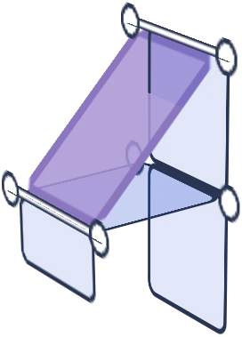
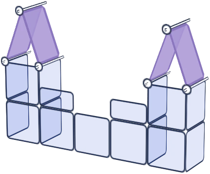
Lightweight panels and snap on connectors shapeshift together.

Iron frame with frosted, water resistant surfaces for light & mighty structures.

Shapeshift kit part
Artistbooths Bundle Component Frosted Lavender Purple (PMS 2715 C) Panel Square (35x35 cm) [8-pack]
Shapeshift kit part
B-grade artist booth panel - discounted cosmetic-second stock
Shapeshift kit part
Shapeshift kit part
Artistbooths Bundle Component Frosted Lilac Purple (PMS 263 C) BOOF Panel Triangle (35x35 cm) [2-pack]
Shapeshift kit part
Shapeshift kit part
Shapeshift kit part
Shapeshift kit part
Shapeshift kit part
Artistbooths Bundle Component Frosted Lilac Purple (PMS 263 C) BOOF Panel Half Square (35x17.5 cm) [4-pack]
Artistbooths Single Connectors & Accessories White Square Wire Grid (35x35 cm)
Shapeshift kit part
Artistbooths Single Connectors & Accessories White Edge Connector

Stand out pop ups.Shapeshifting setups.

Custom shapes and mix-and-match colours, built to sell for years.

Shop
Scroll

build a booth that builds a crowd

Little parts. Big payoff.

Why makers love our booths.

Every detail pulls its weight.

Stand out, sell out.

Be the eye-catching brand whose cohesive look draws a crowd and gets remembered.

Grow with you.

Enough parts to range products from small table to large booth.

Shape your brand.

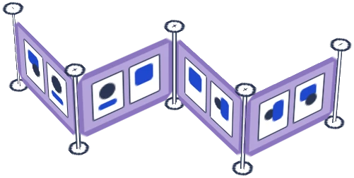
Triangles, rectangles, hinge panels and connectors, in colours you mix yourself, for infinite display setups.

Be memorable.

Seasonal colours keep your brand unique. Frosted finish gives your art a soft spotlight.

Range & sell more.

Self-serve more customers with parts that make the most of smaller spaces.

Strong where it counts.

An iron core holds heavy stock whilst water-resistant surfaces shrug off spills and weather.

Packs light, carries safe.

Panels weigh 150g each. The double-wall carry box protects up to 30 decorated panels every trip.

Spares for years.

Every kit packs extra parts, so when you scale up or lose a piece you can keep running your vision.

Your products centre stage

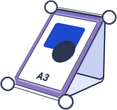
Light diffusing panels.

Anti glare & bright product display

Build your modular display kit

Mix and match colours and shapes. Sized for market, convention and trade-show tables up to 6 ft / 180cm.

1. Choose kit size
2. Choose Kit Colours
Only available
2aChoose your base 24 square & 22 multi-shape panel colours What colour would you like the first half of multi-shape panel colours to be?
2bWhat colour do you want the other half of your squares to be in this kit? What colour do you want the other half of your kit to be? Included · $0
Get a multi-colour setup by swapping 24 of 48 square panels in another colour.
Get a multi-colour setup by swapping half your kit's panels to another colour.
3. Bundle and Save (optional)

Make it a multicolour setup with extra squares or base kit

Get 5% extra when you bundle any add-on.
24x Square Panel Add-on (35cm / 13.8in) - Works with Artistbooths Shapeshift Kit
24 square panels

24x Square Panel Add-on (35cm / 13.8in) - Works with Artistbooths Shapeshift Kit

$450.00

Scarlet Red Frosted

Shapeshift Base Kit
46 multi-shape panels156 accessories

Shapeshift Base Kit Add-on

$699.00

Grape Purple Frosted

Your bundle
Free express shipping deal
Orders over $300 AUD
dhm
d h m
Your selection
American Express Apple Pay BancontactGoogle Pay Mastercard Shop Pay Union PayVisa JCBDiscoverDiners ClubMaestro
🌐 We ship globally express tracked⭐ 4.9🇦🇺 Designed in Aus
Build your own
Duo color display
Colorful display

Modular cube panels that snap together in minutes. Pick a color to start with and build & grow. for years.

Modular artist display booth at a craft market
Indoor pet playpen enclosure